A magazine about repurposing: repurposing traditional type hierarchy while adhering to a structured grid.
![]()
The significance of “repurposing”
![]()
![]()
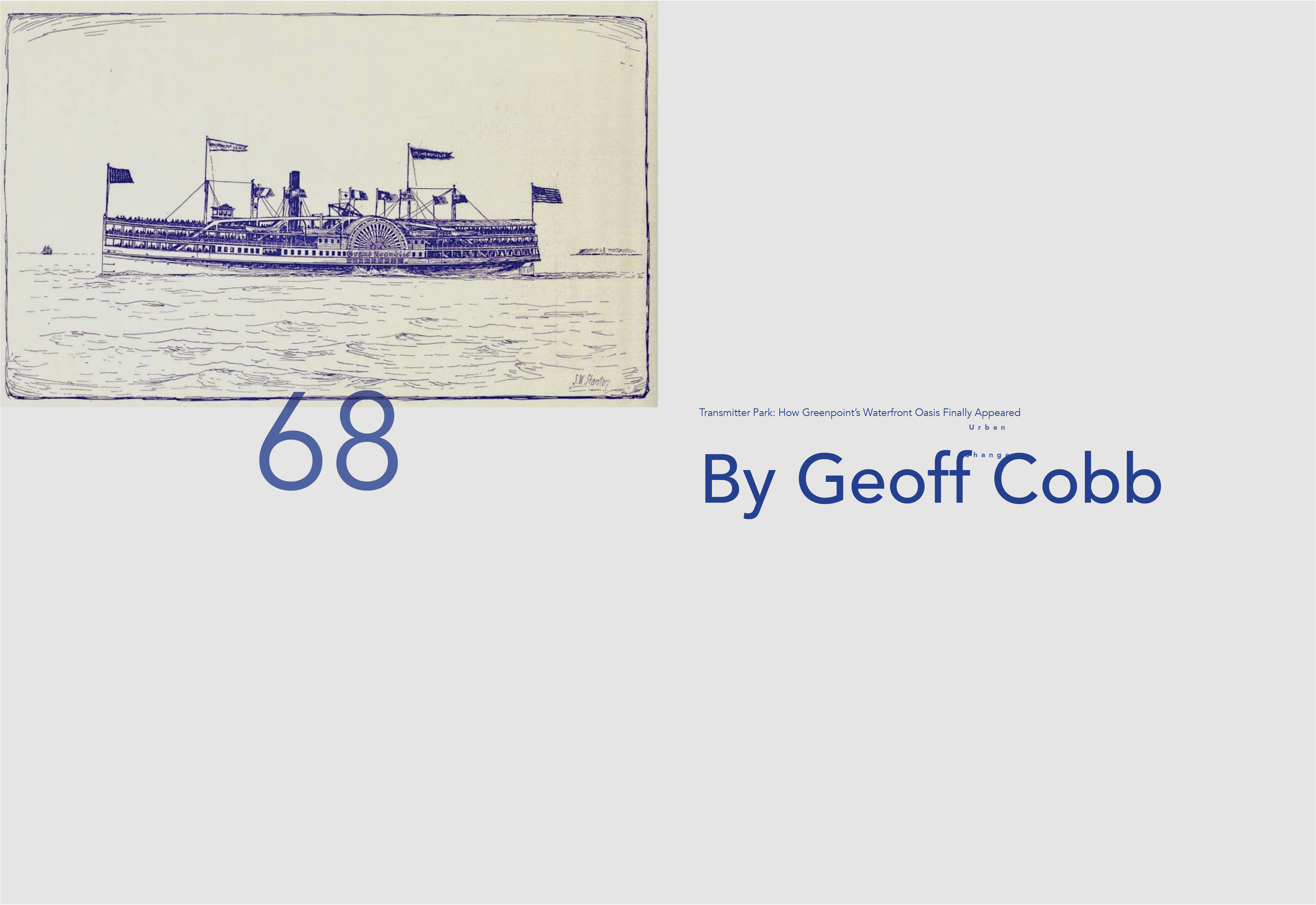
Repurpose Magazine: Challenging traditional type hierarchy to accentuate my theme
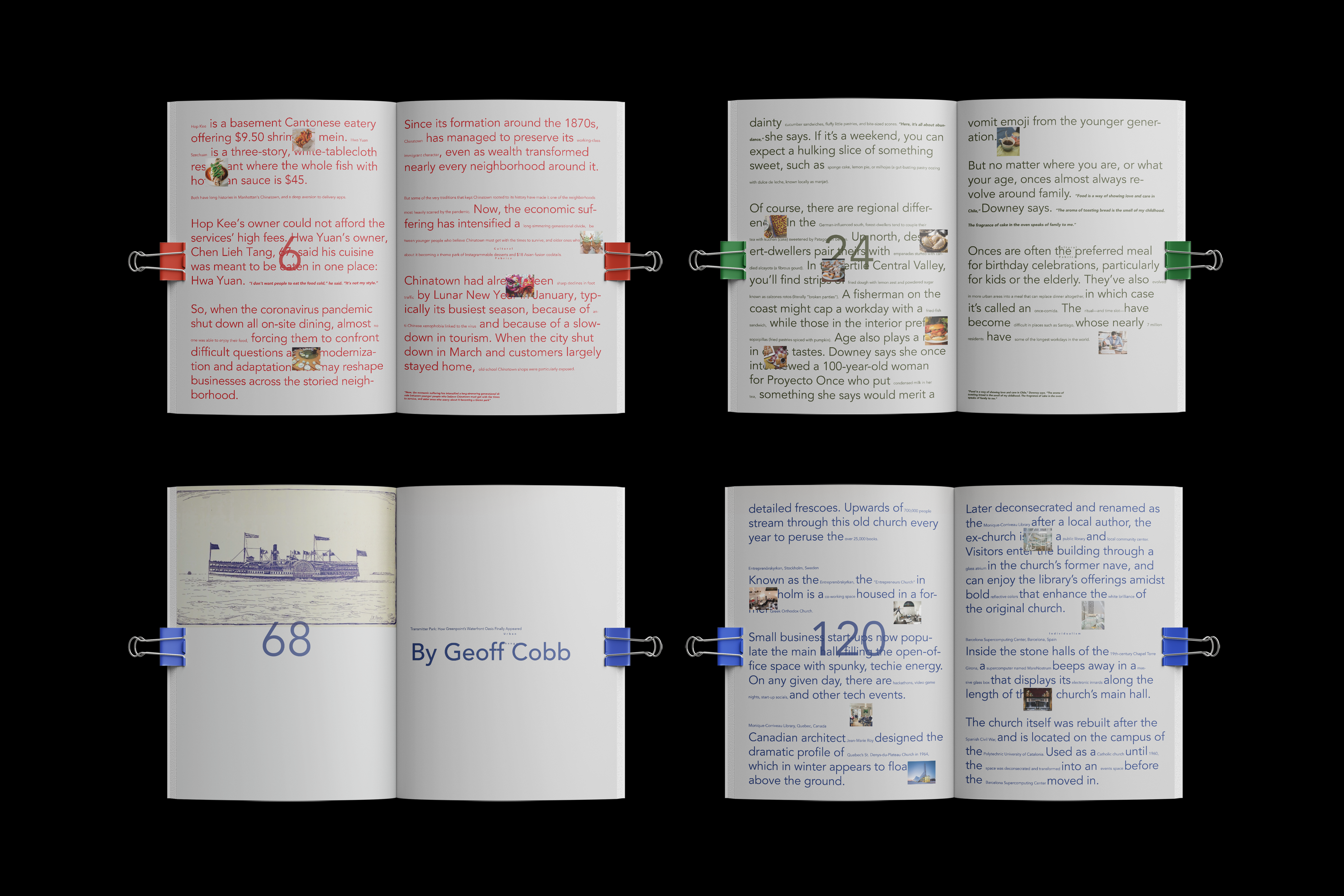
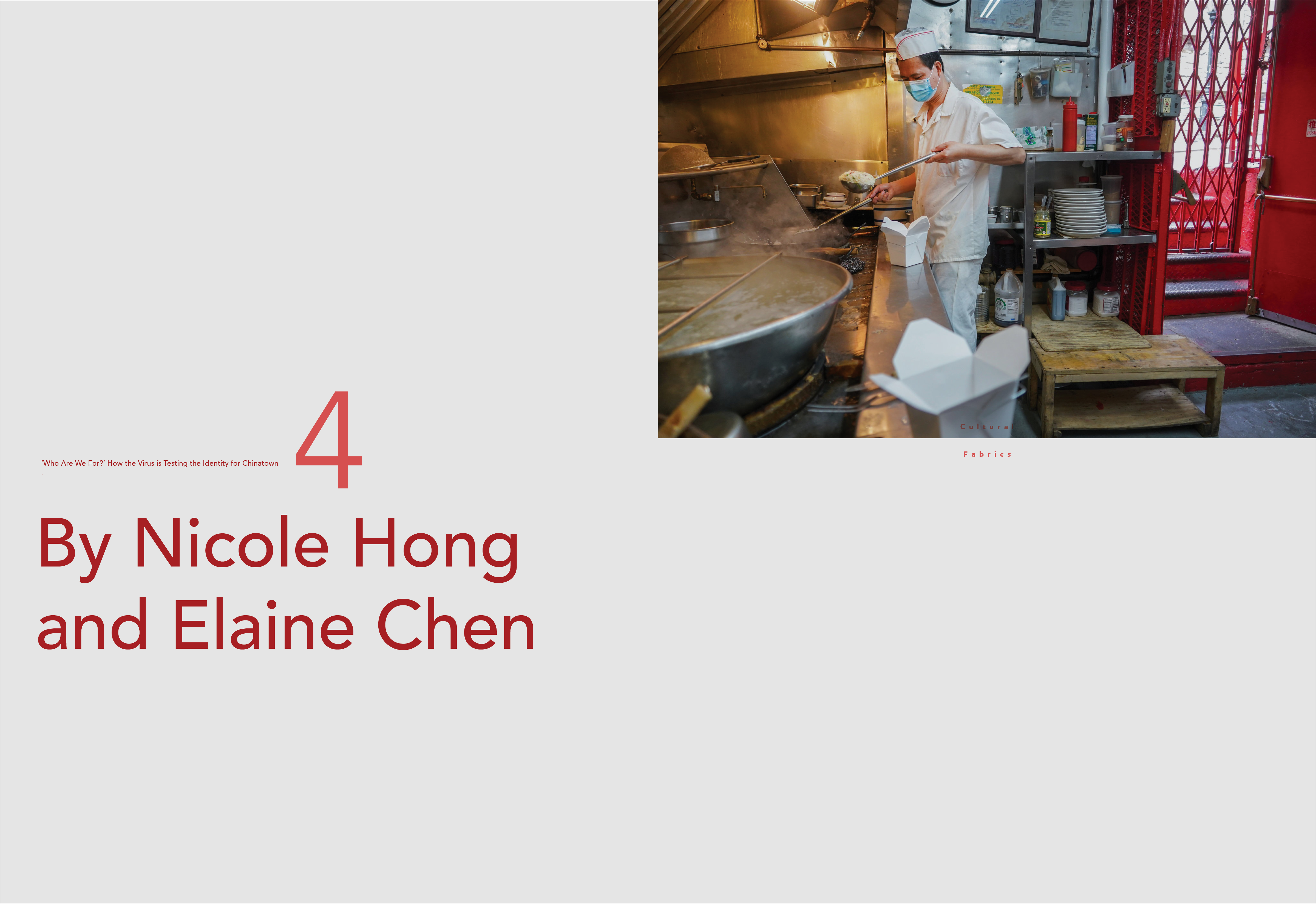
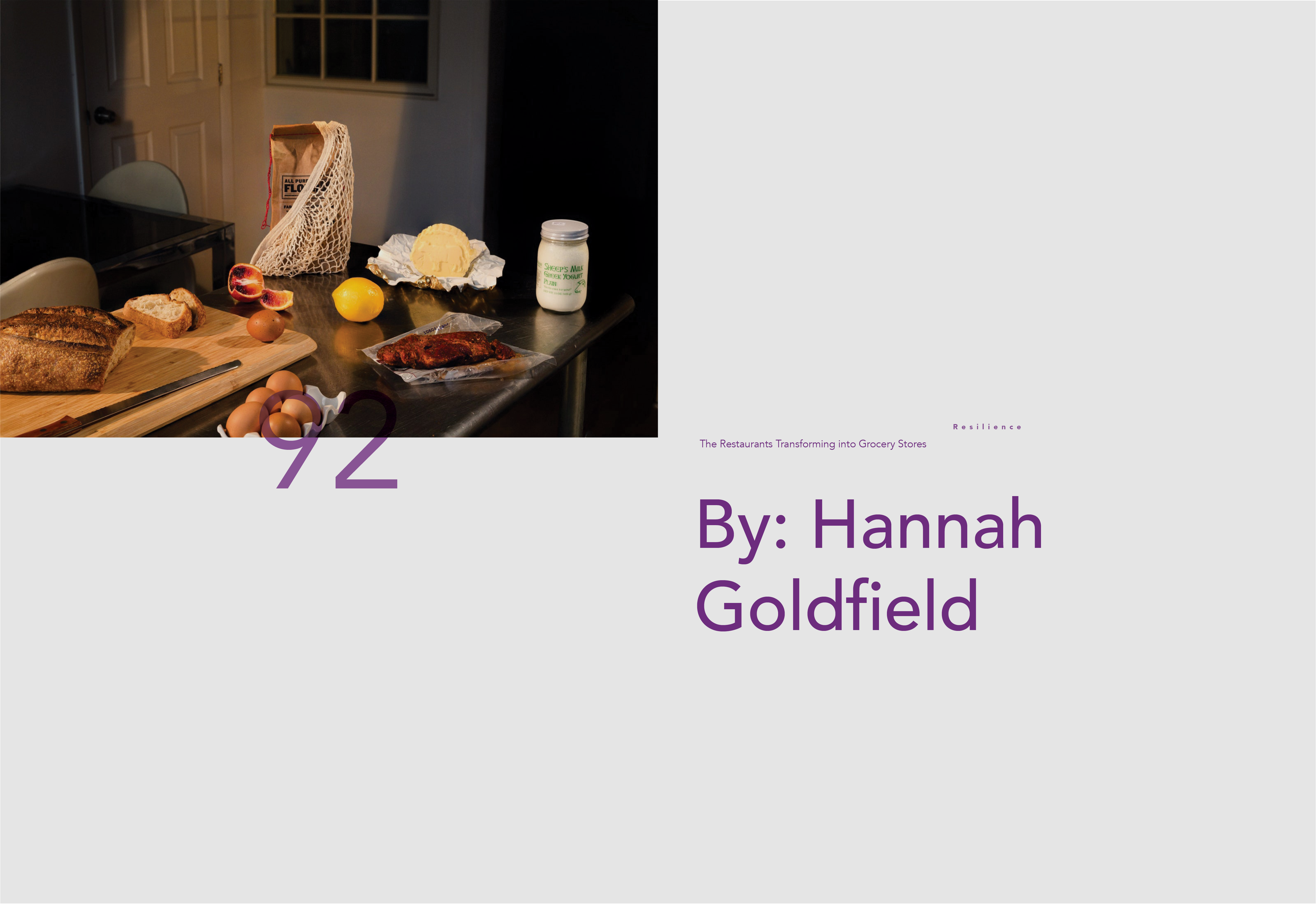
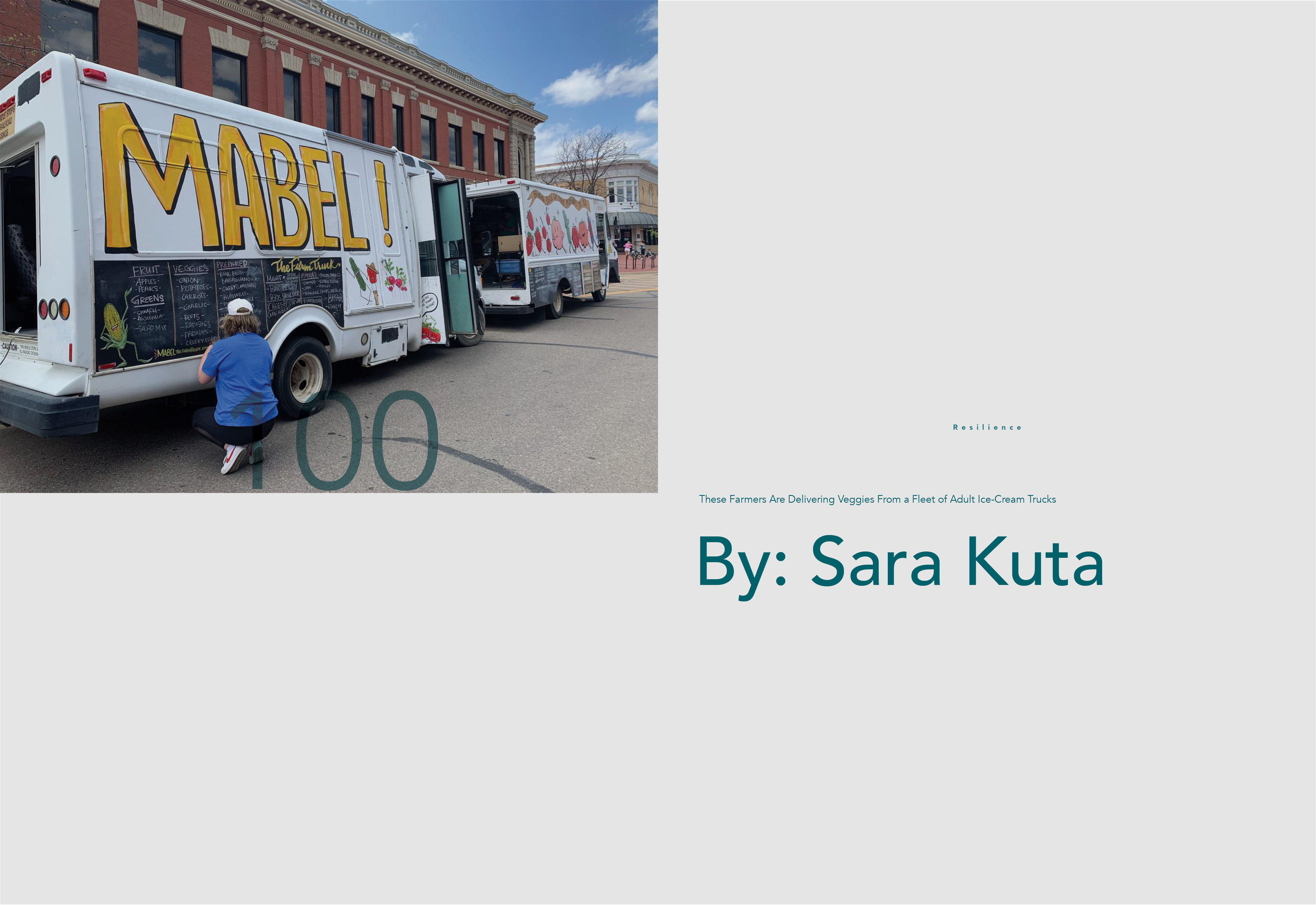
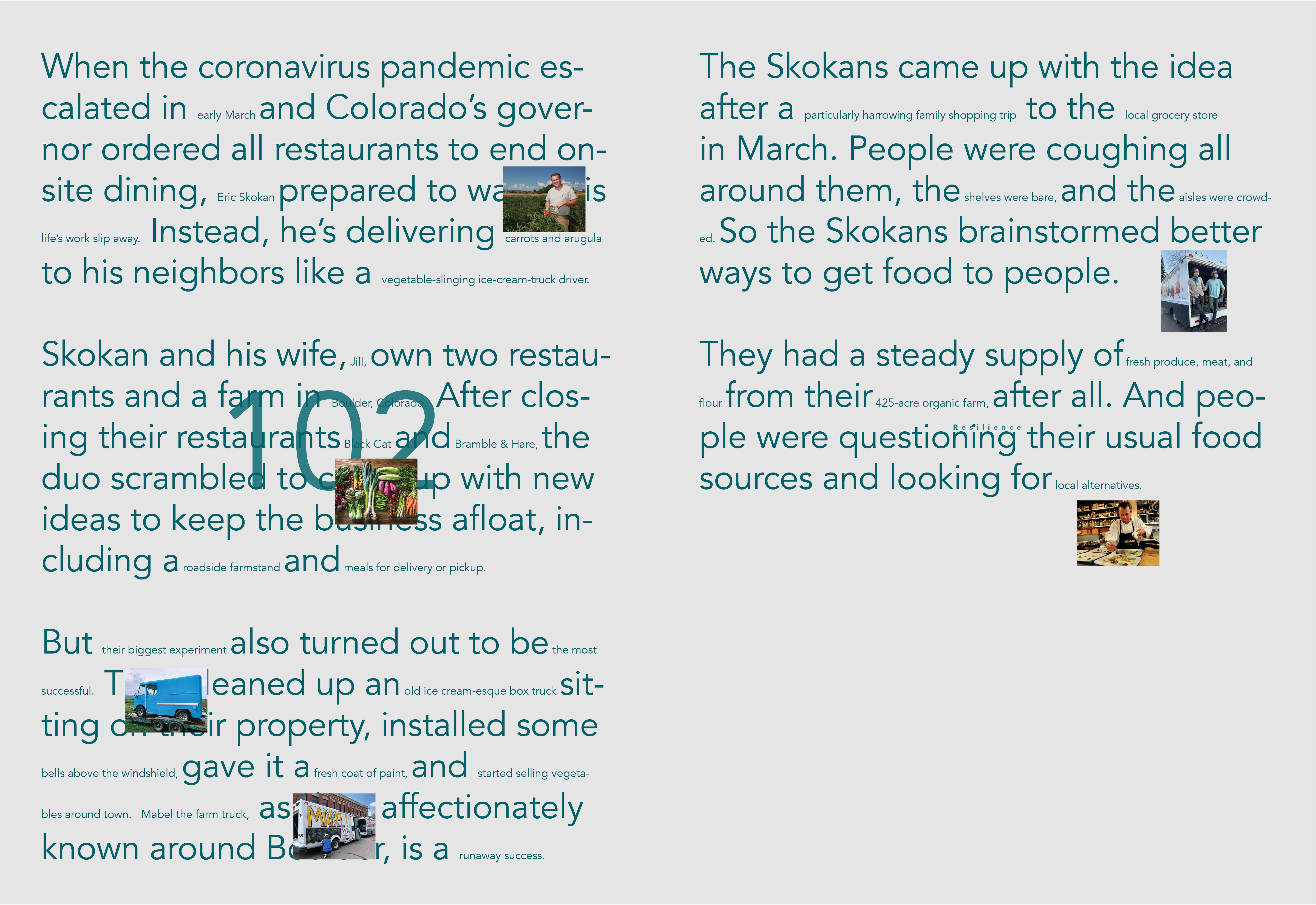
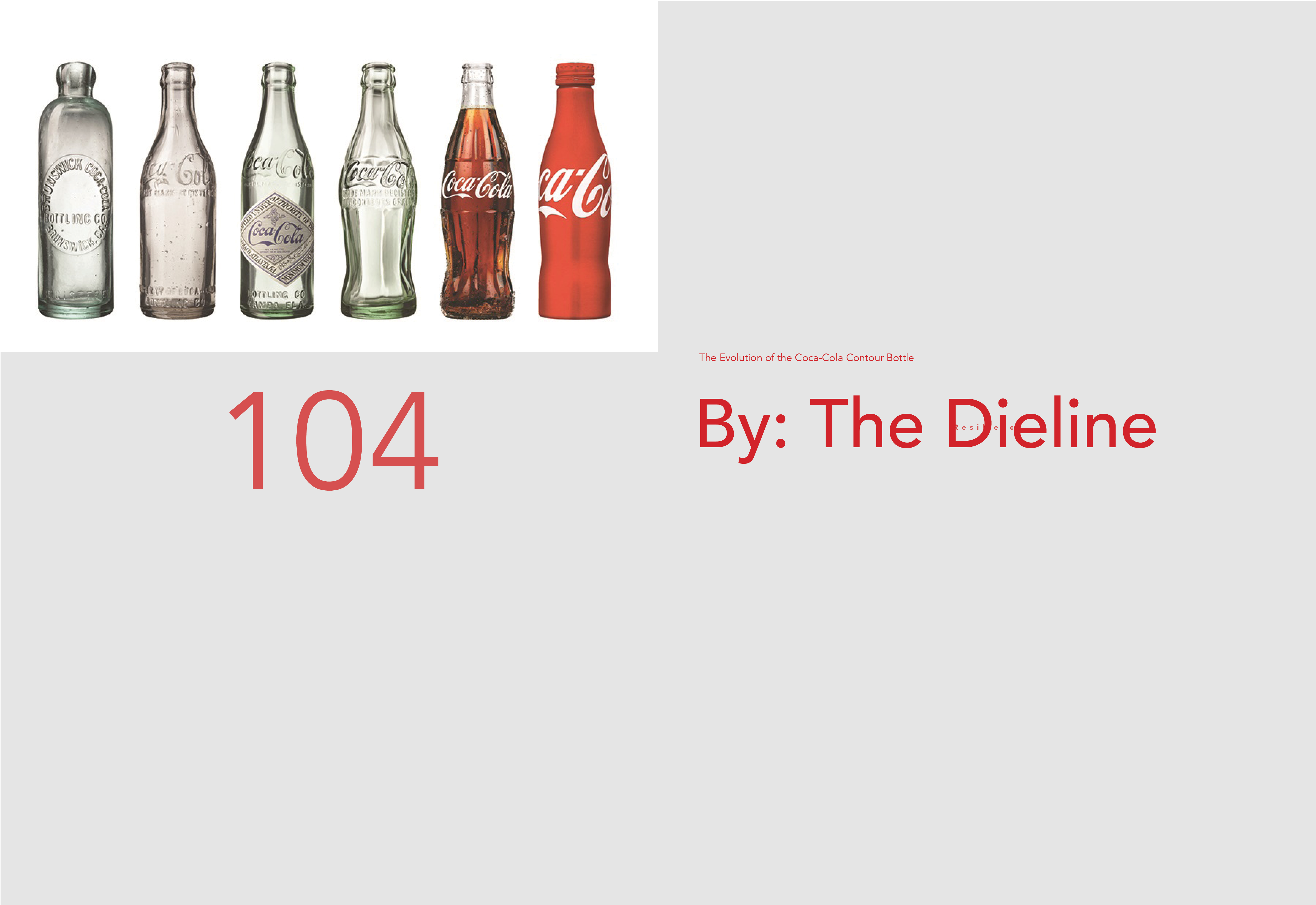
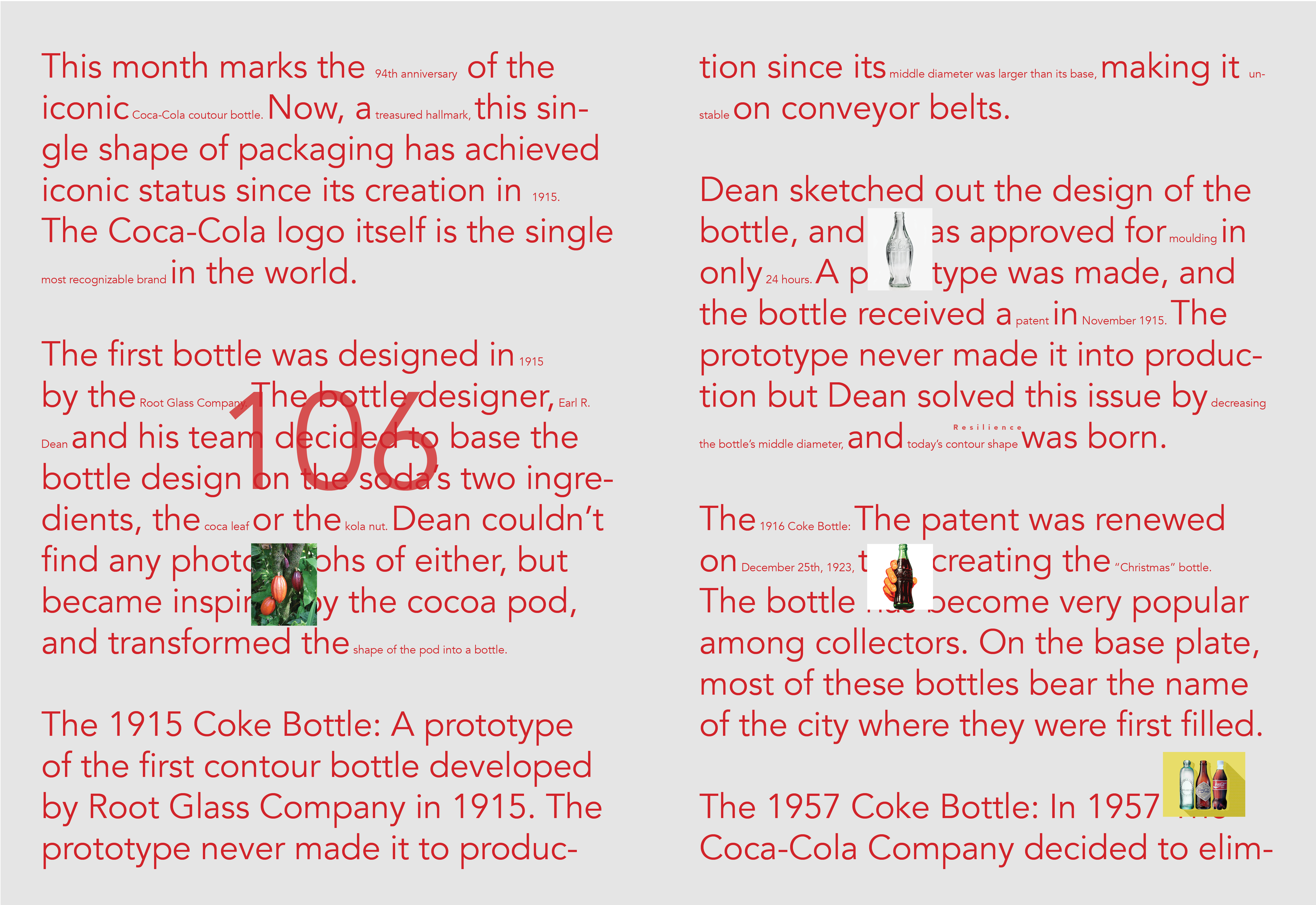
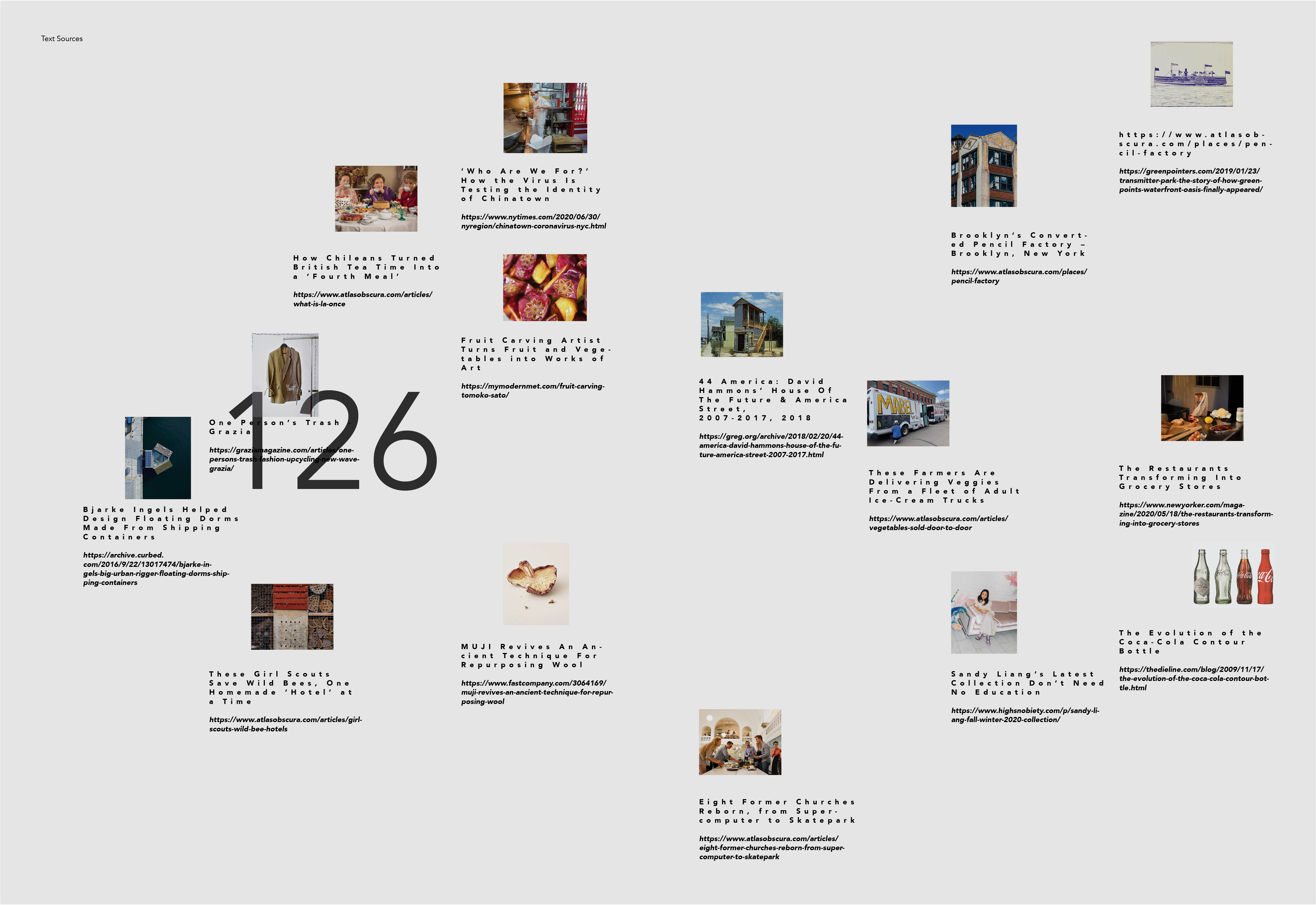
I created an editorial publication called Repurpose Magazine. I was interested in the theme of repurposing because many businesses and individuals have had to “repurpose” in order to acclimate to the the changes brought on by the Covid–19 pandemic.
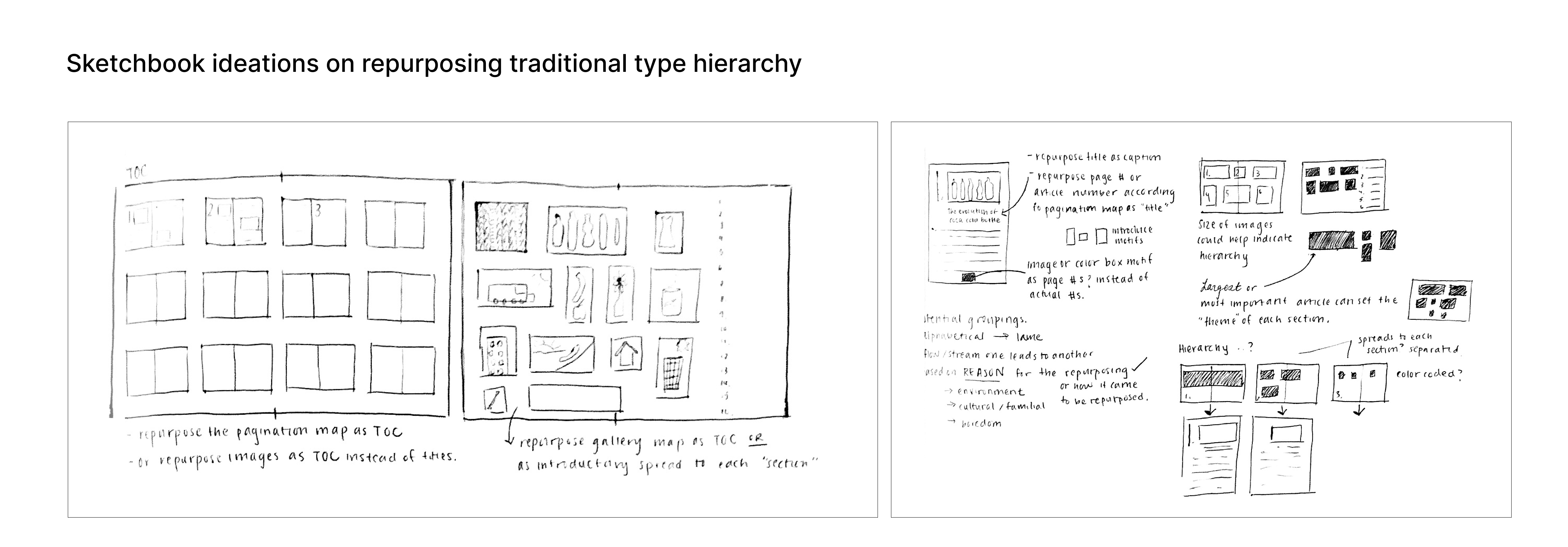
I challenged myself by attempting to repurpose the images and text on my page to bring them out of the traditional type hierarchy while still adhering to a structured grid system. I blew up bylines and minimized titles. Images are tiny & the more important “highlighted” portions of the text are in size 10 to accentuate the act of repurposing.
![]()
![]()
Final magazine
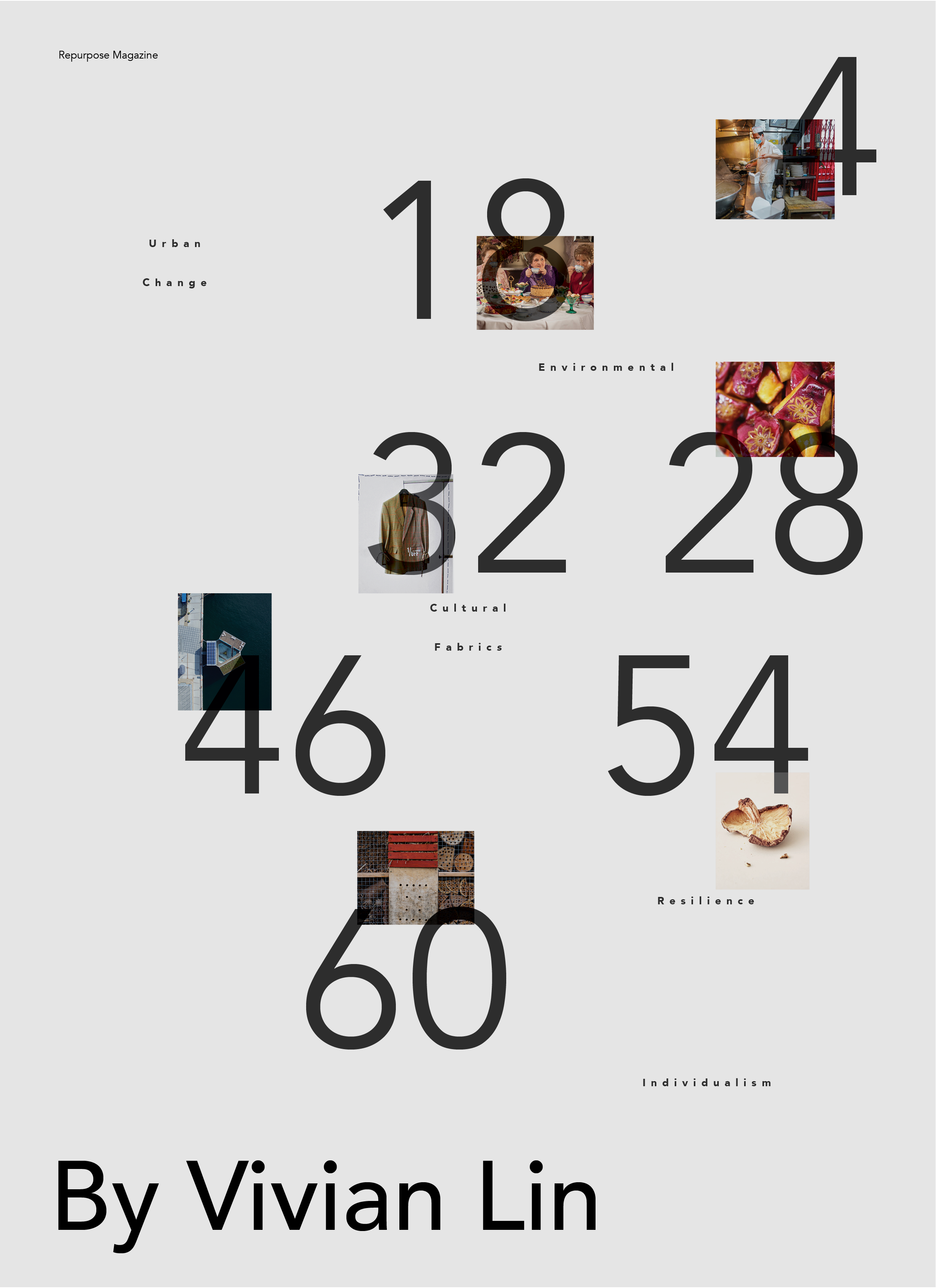
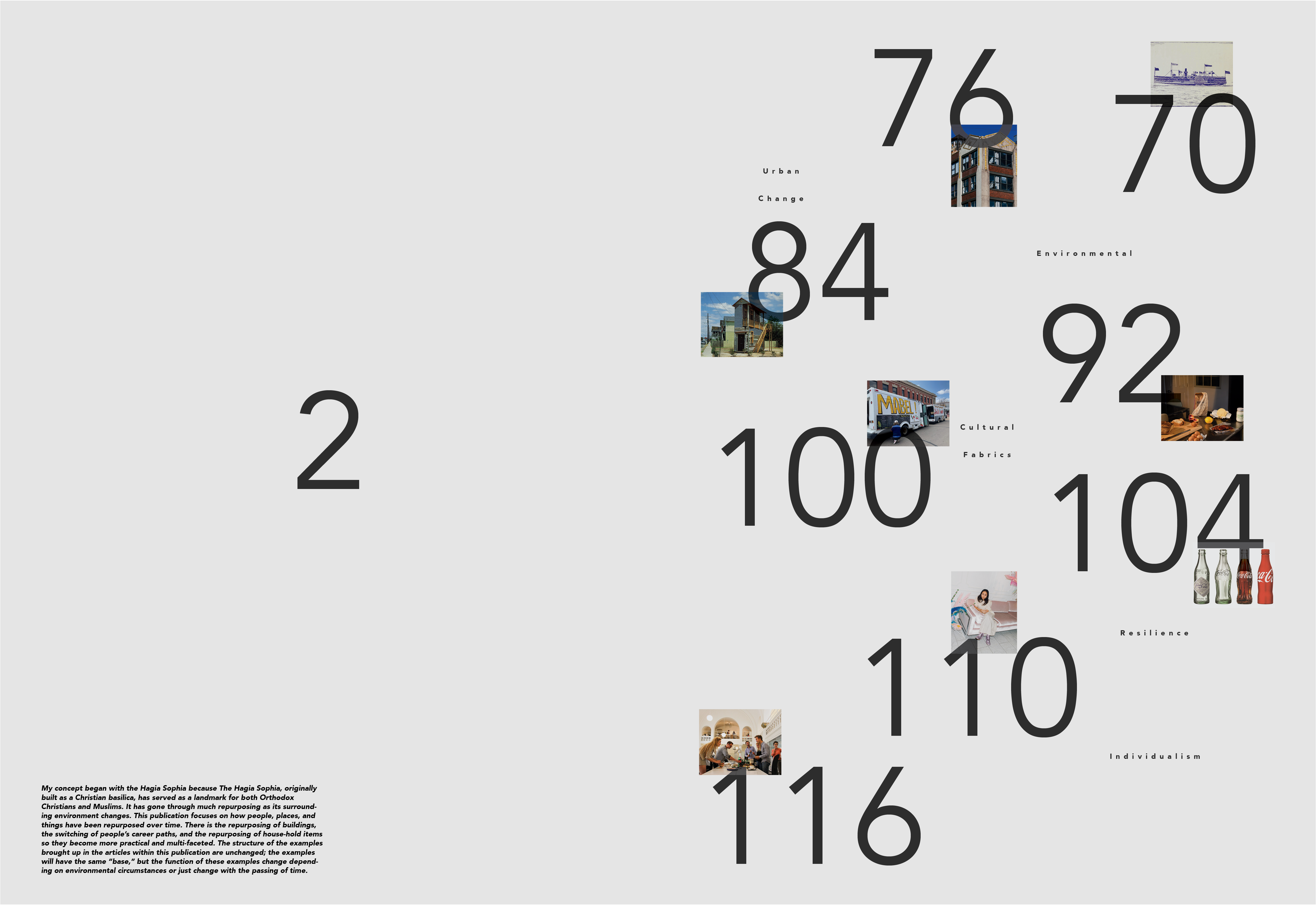
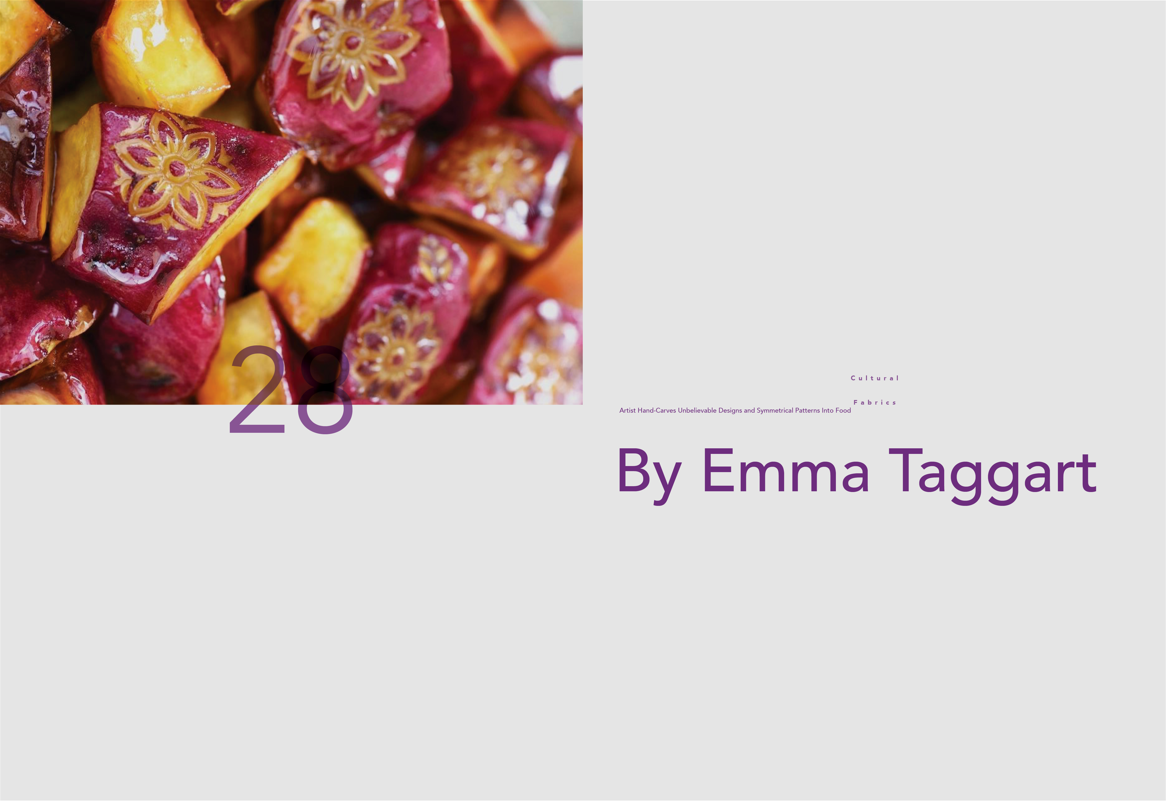
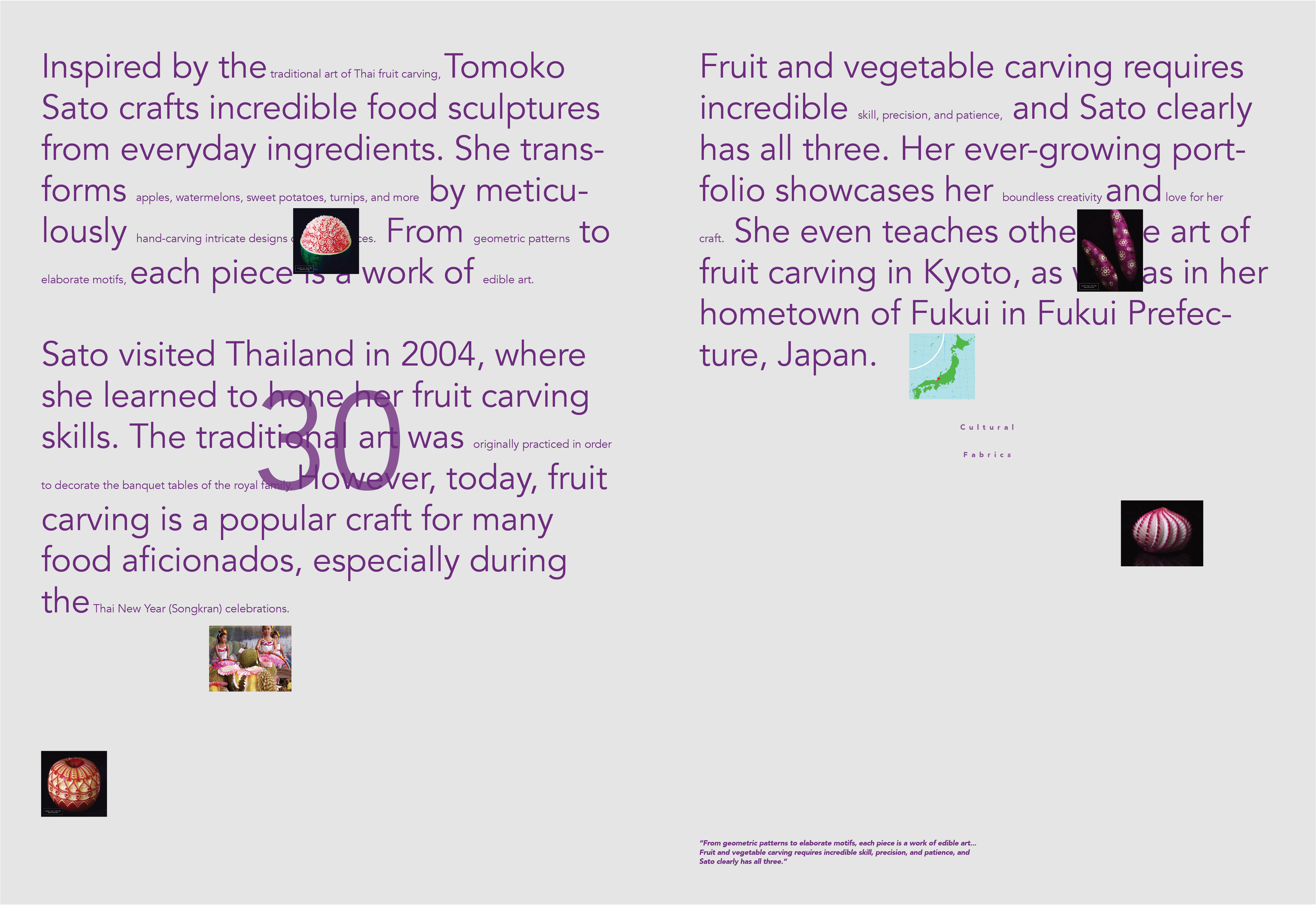
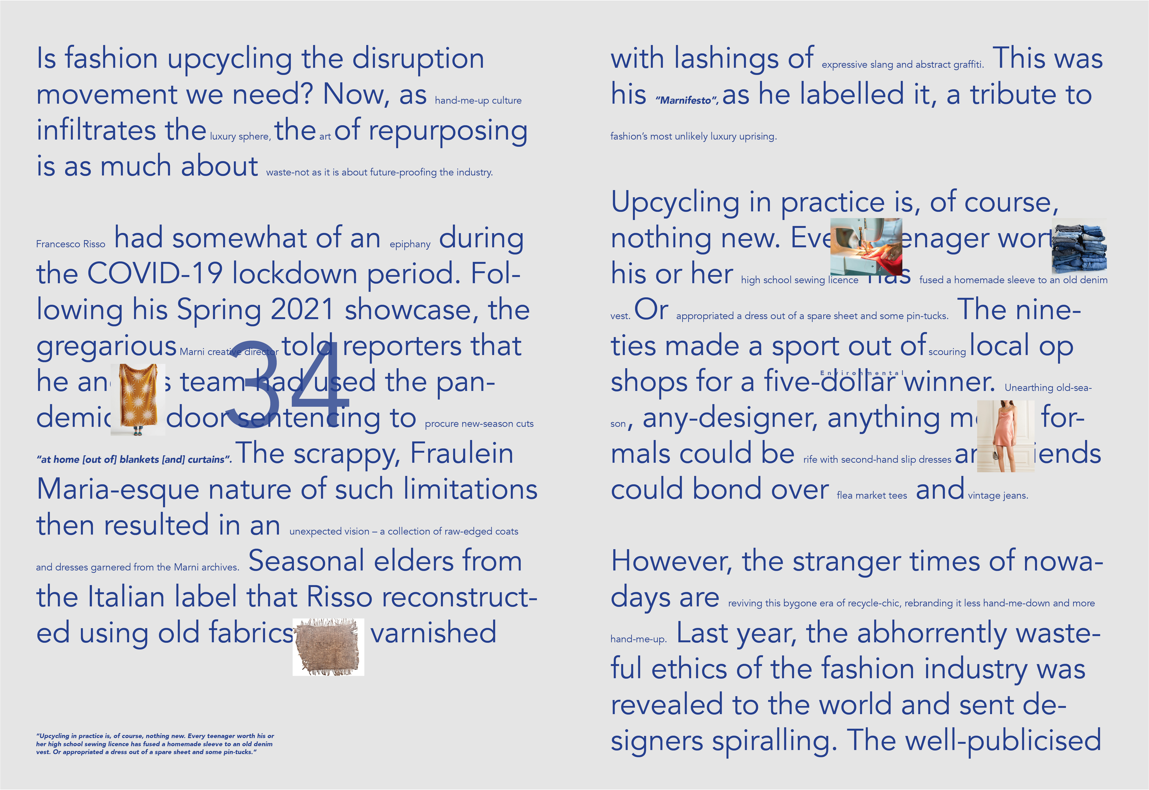
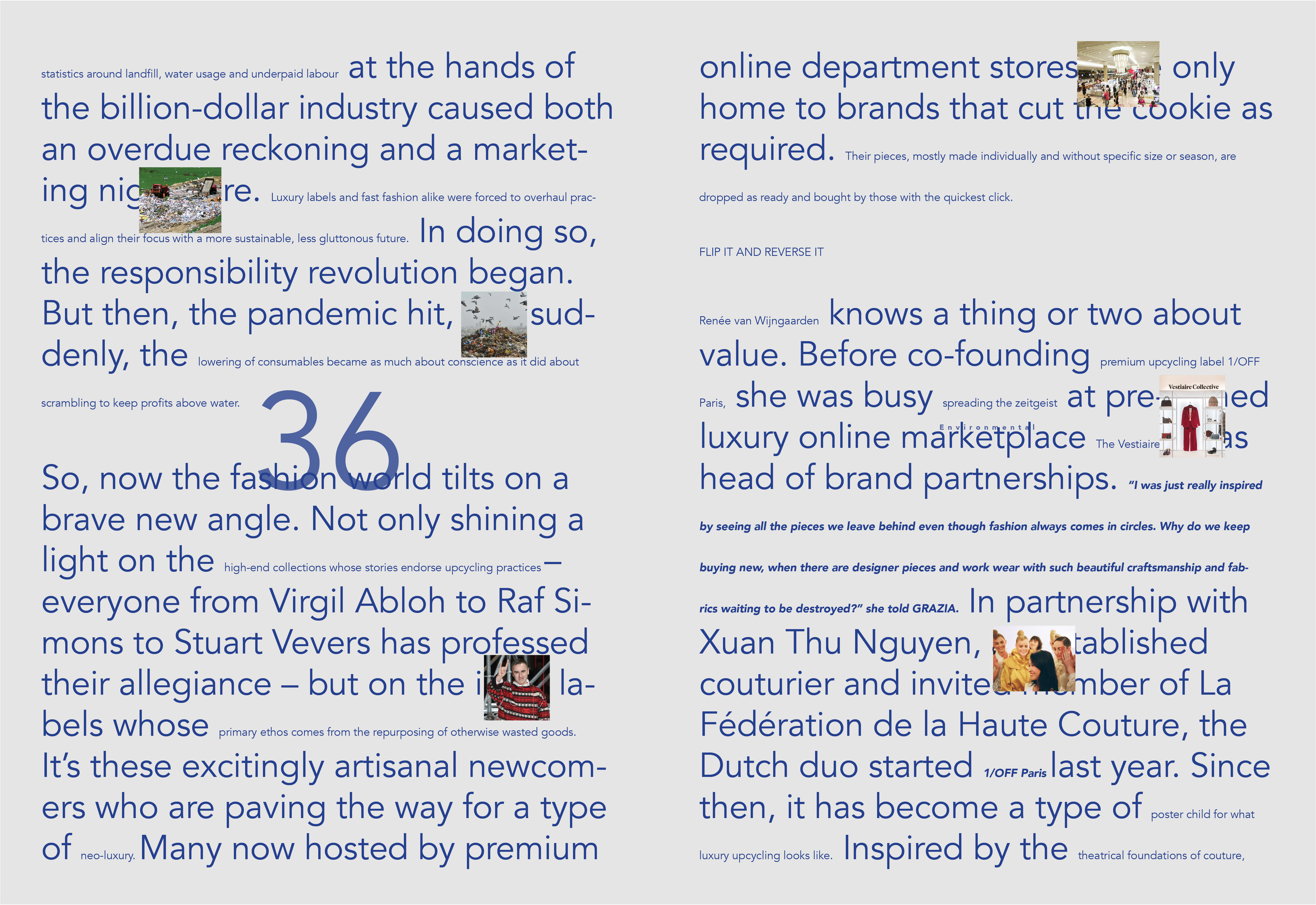
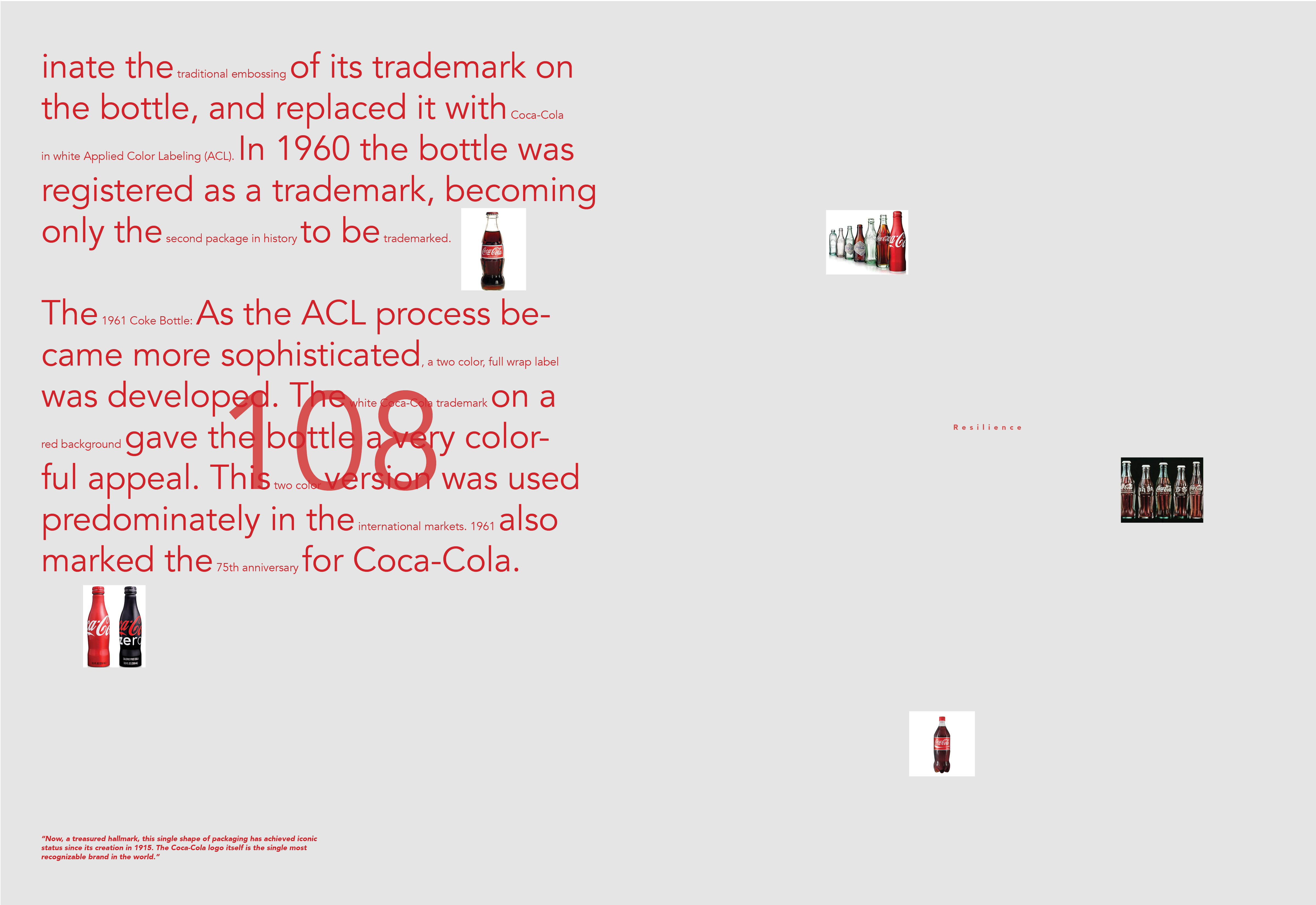
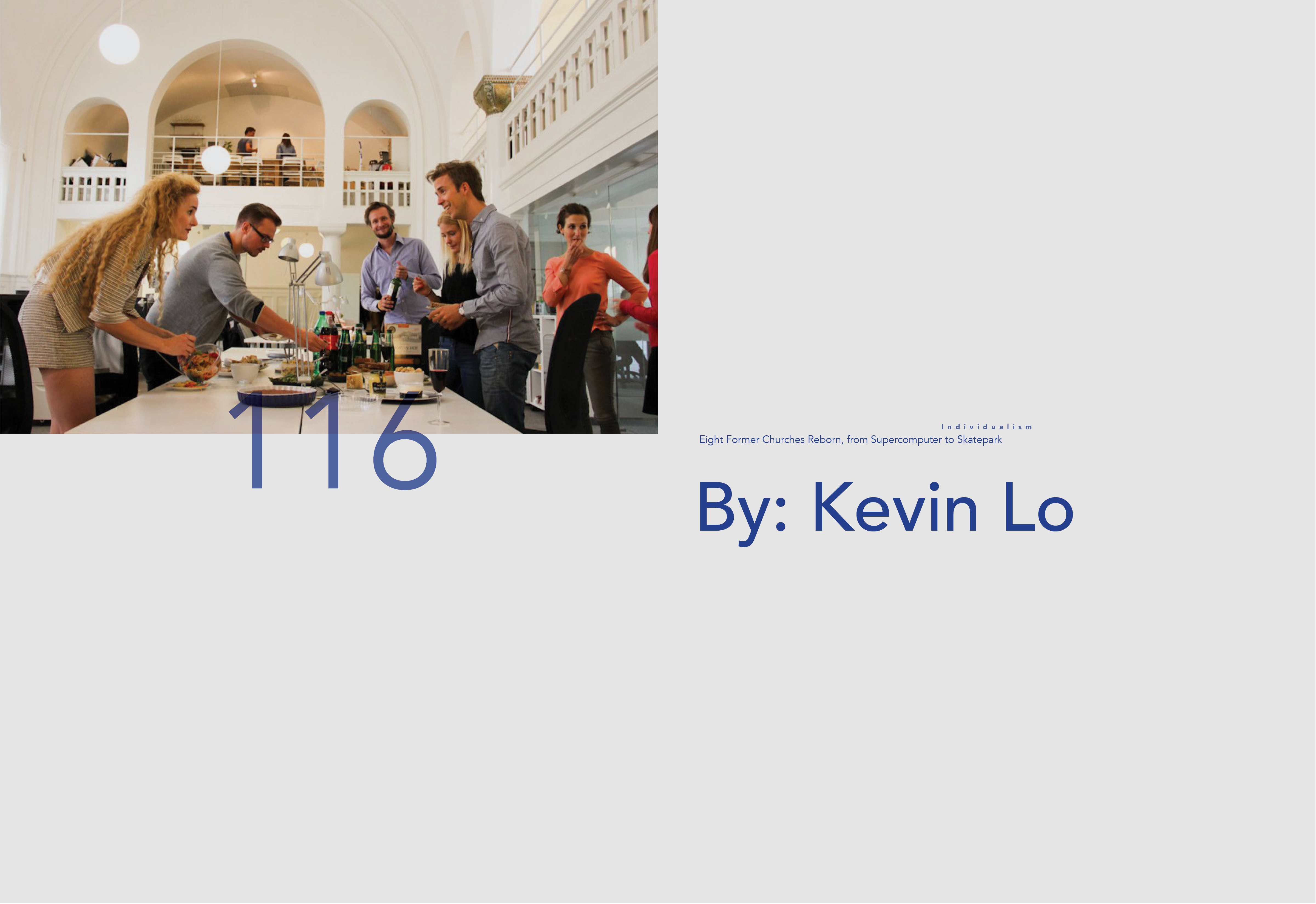
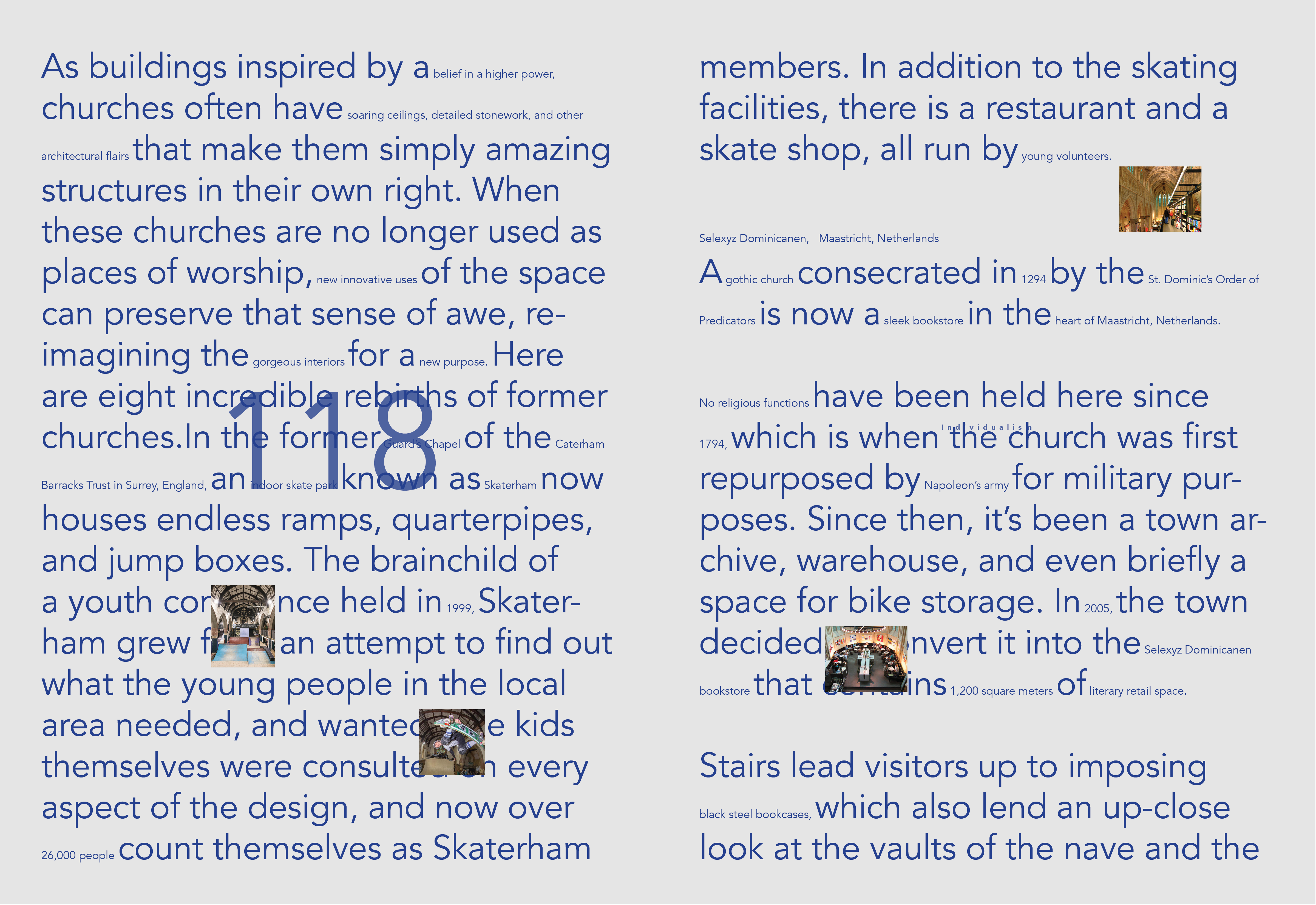
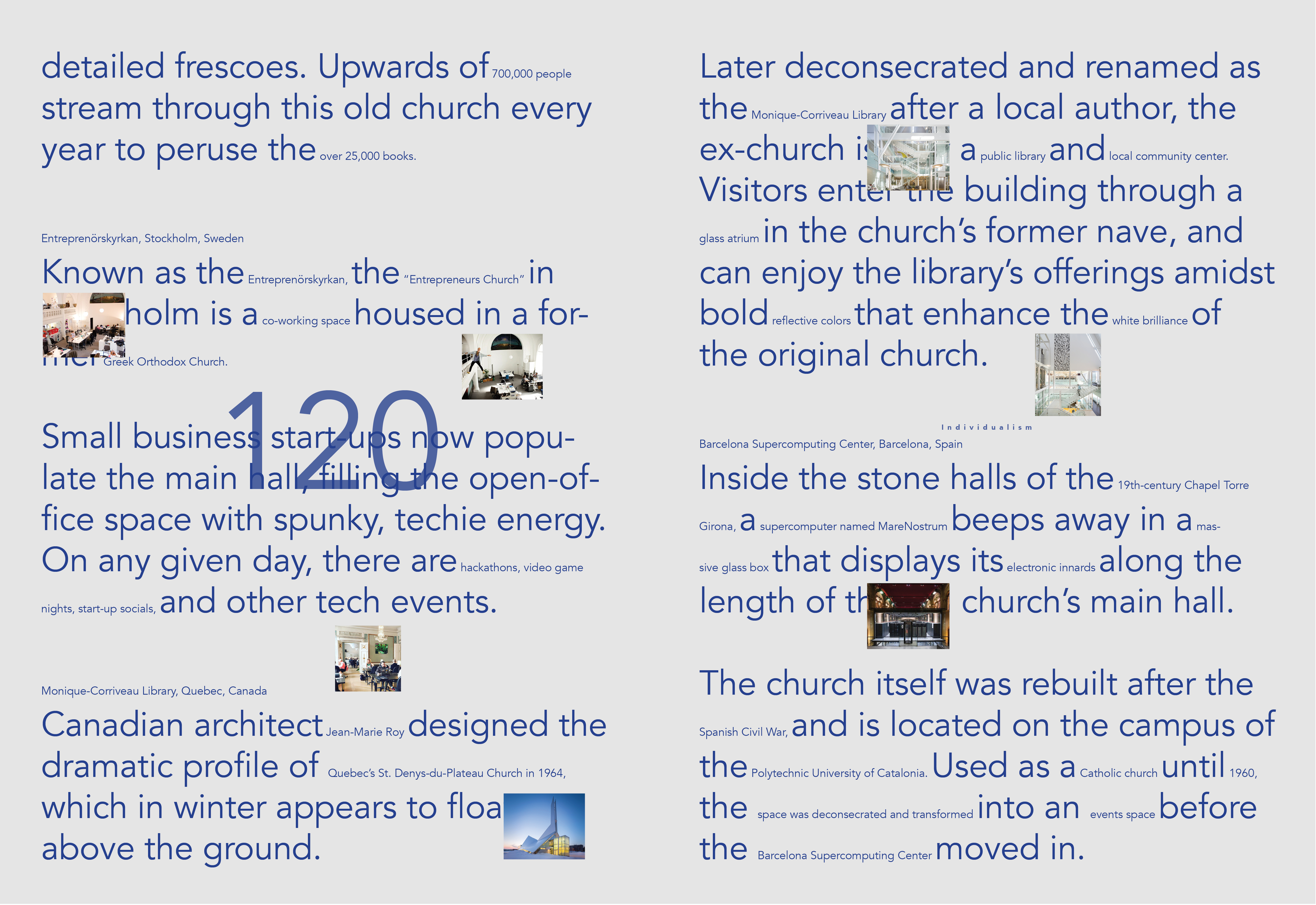
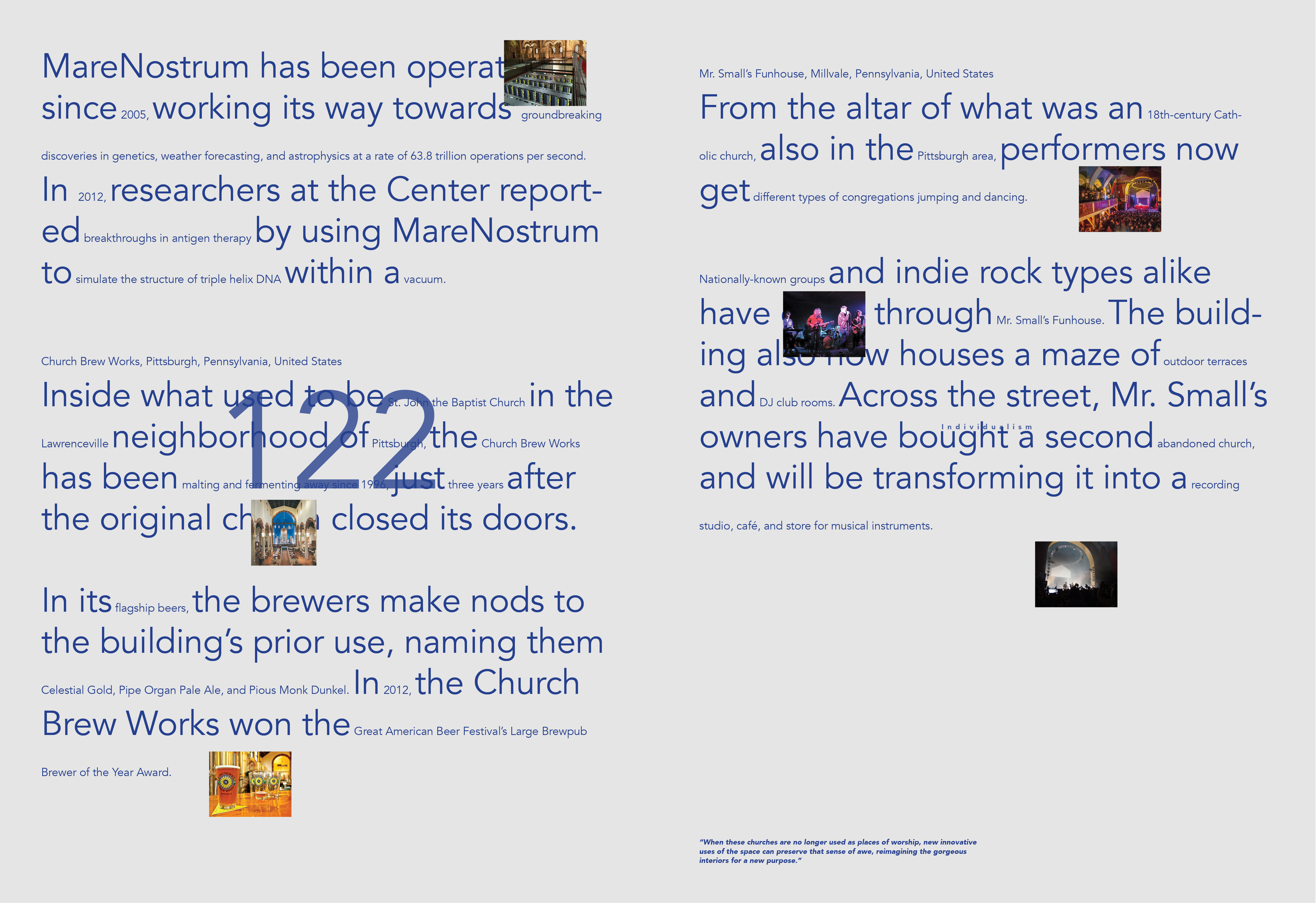
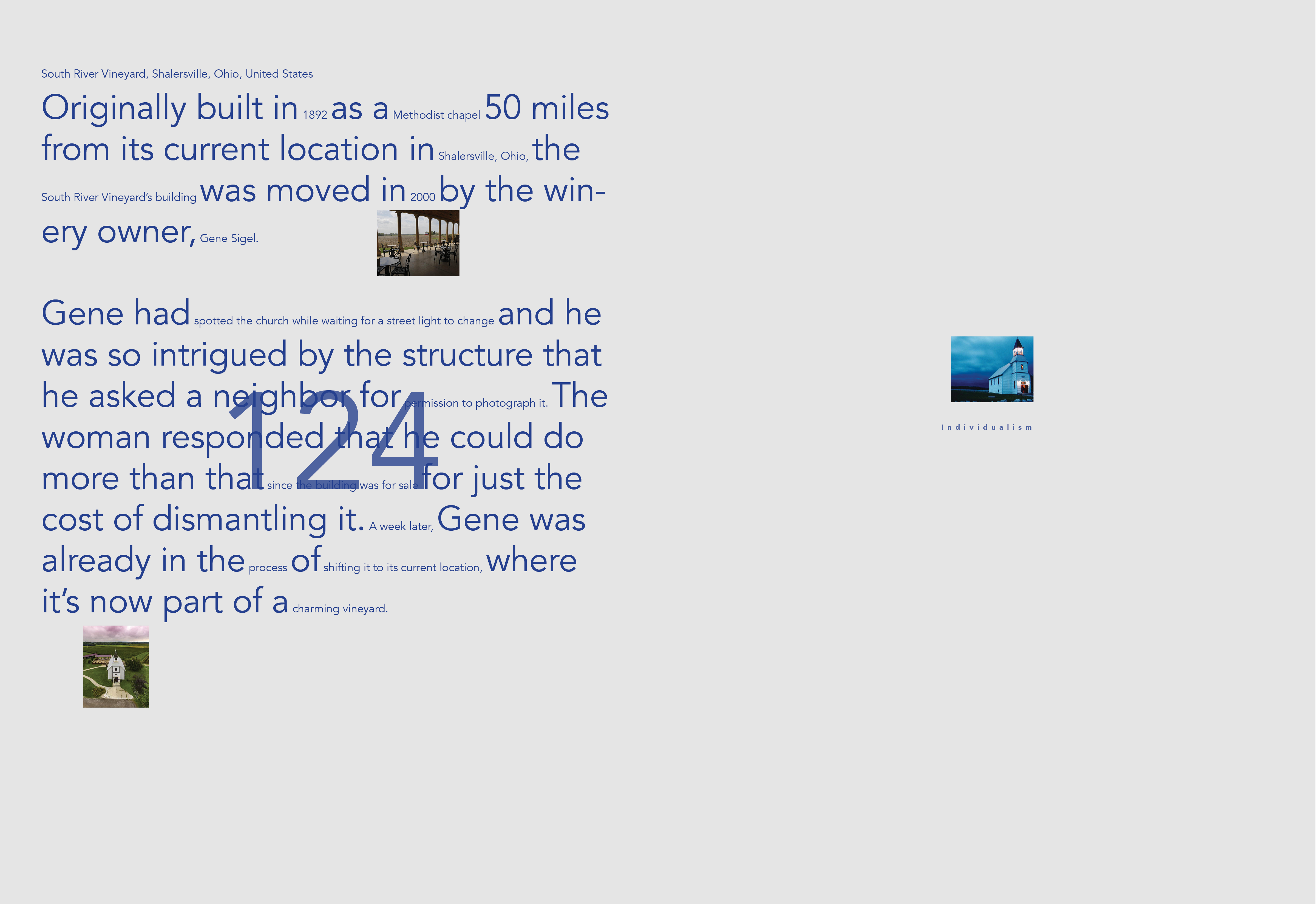
The articles in my publication all relate to repurposing over time,whether it is how architecture is repurposed, how individuals go through career or life pivots, or how objects are repurposed to become more practical and multifaceted, etc. Five different colors separate the stories within the publication five different categories of repurposing: urban change, environmental, cultural fabrics, resilience, and individualism.
![]()
![]()
![]()
![]()
![]()
![]()
![]()
![]()
![]()
![]()
![]()
![]()
![]()
![]()
![]()
![]()
![]()
![]()
![]()
![]()
![]()
![]()
![]()
![]()
![]()
![]()
![]()
![]()
![]()
![]()
![]()
![]()
![]()
![]()
![]()
![]()
![]()
![]()
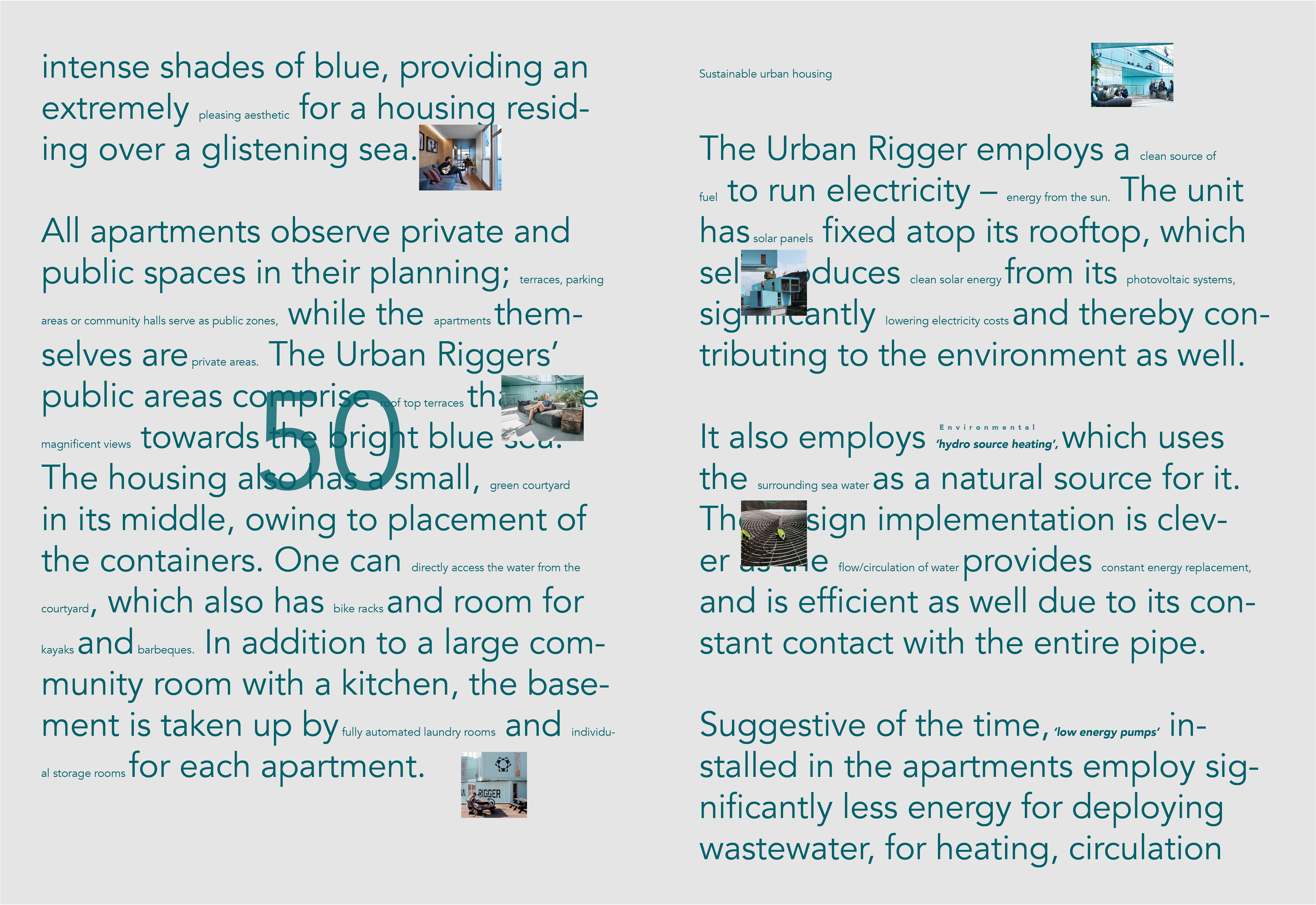
![]()
![]()
![]()
![]()
![]()
![]()
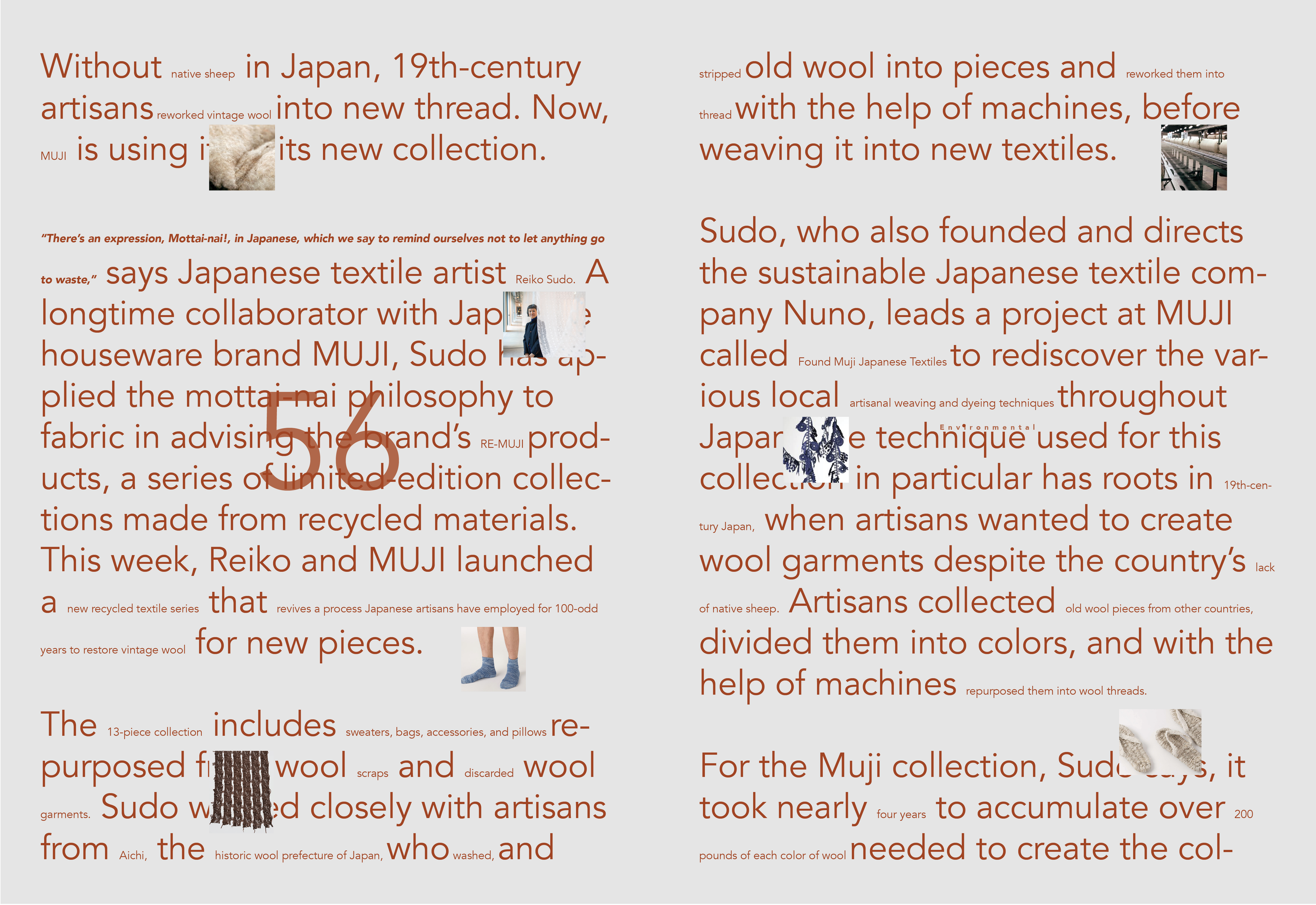
![]()
![]()
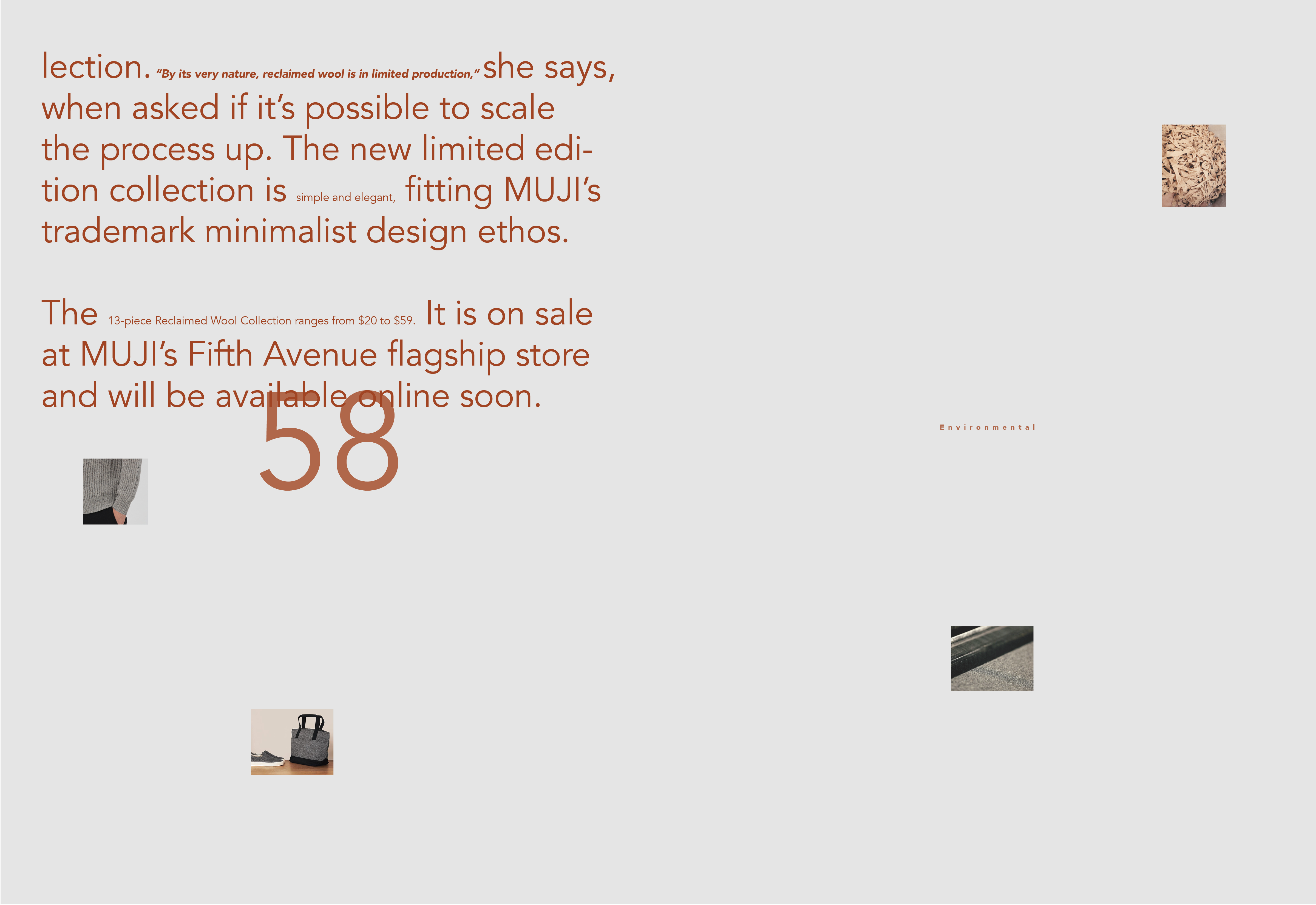
![]()
![]()
![]()
![]()
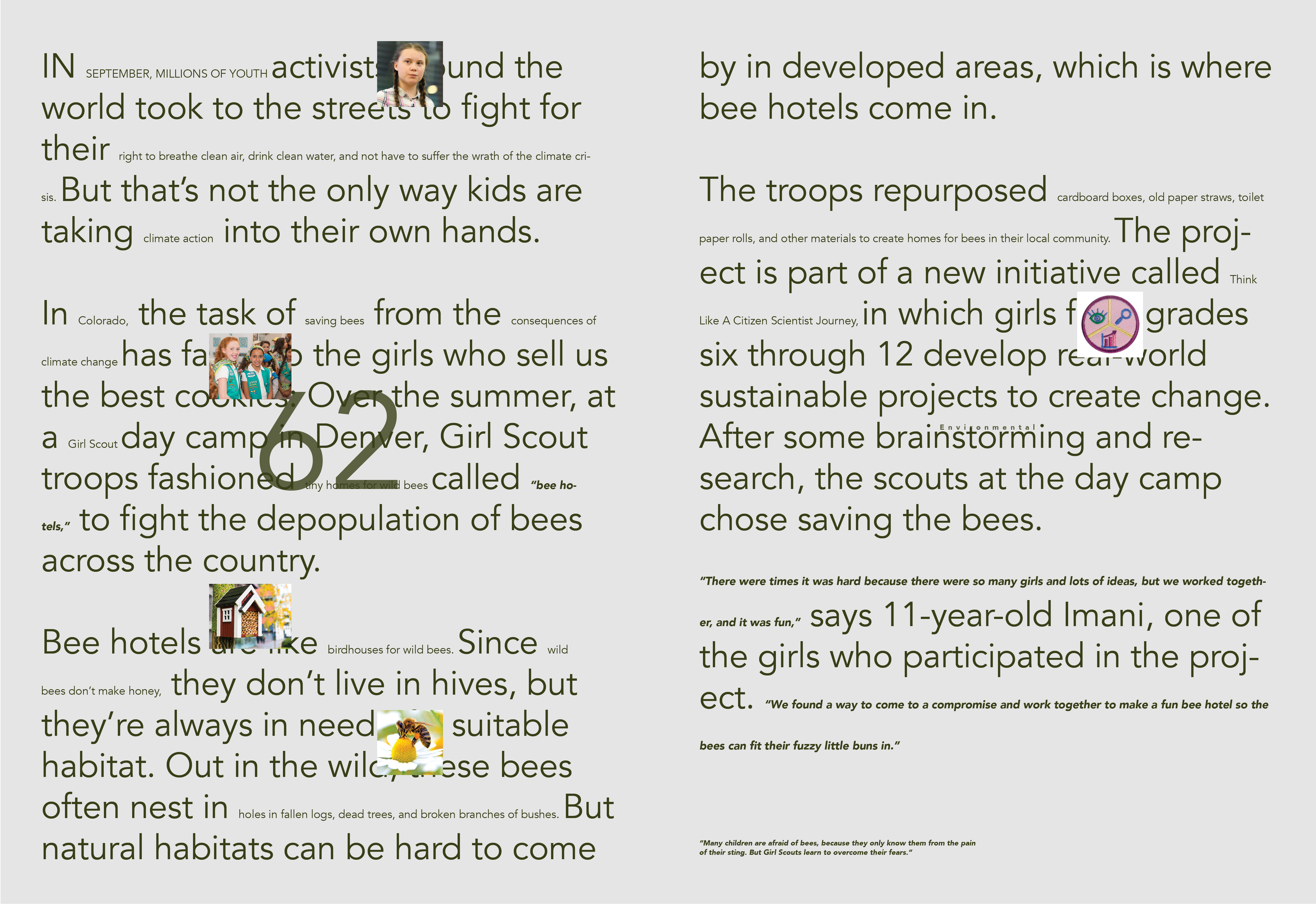
![]()
![]()
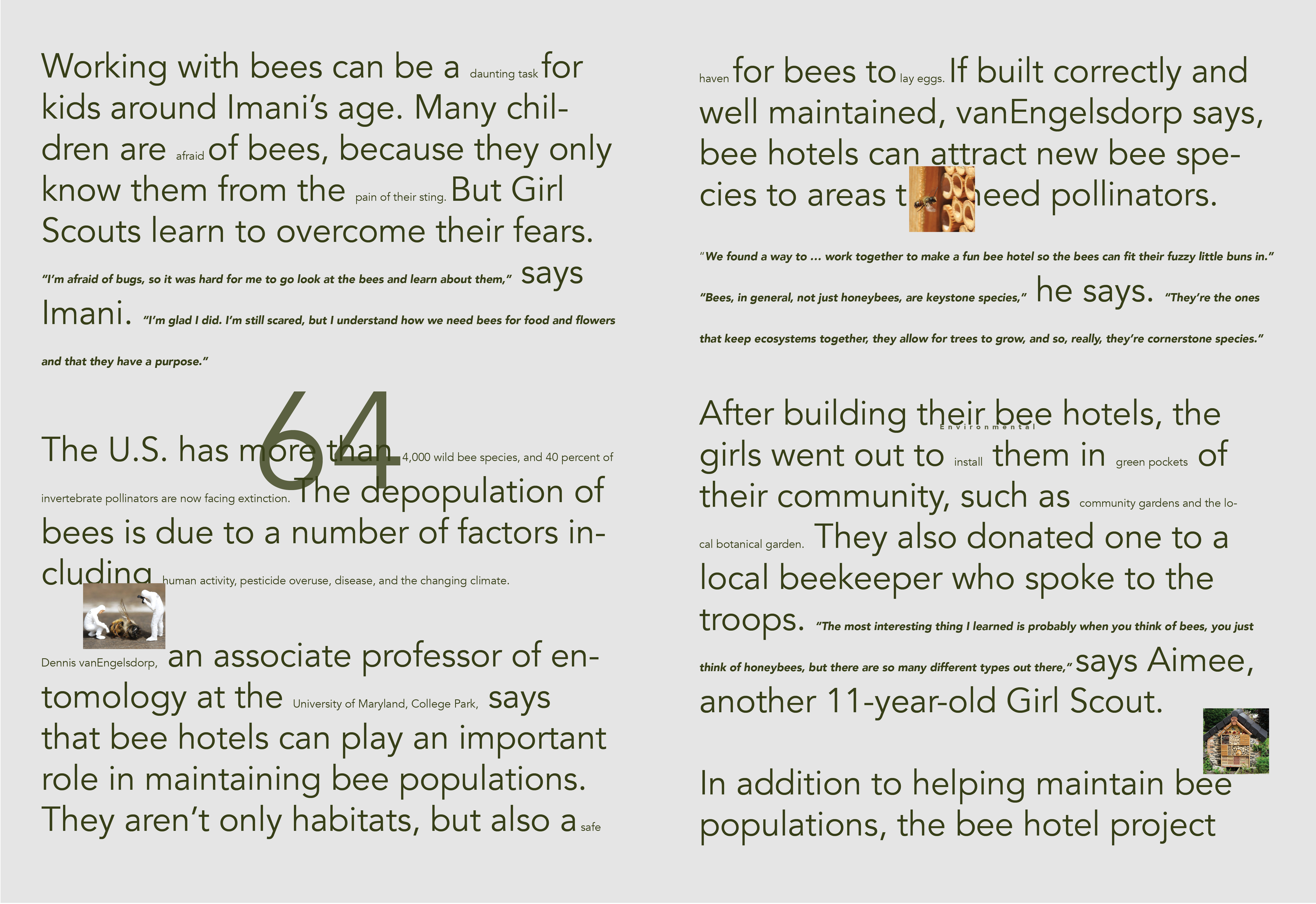
![]()
![]()
![]()
![]()
![]()
![]()
![]()
![]()
![]()
![]()
![]()
![]()
![]()
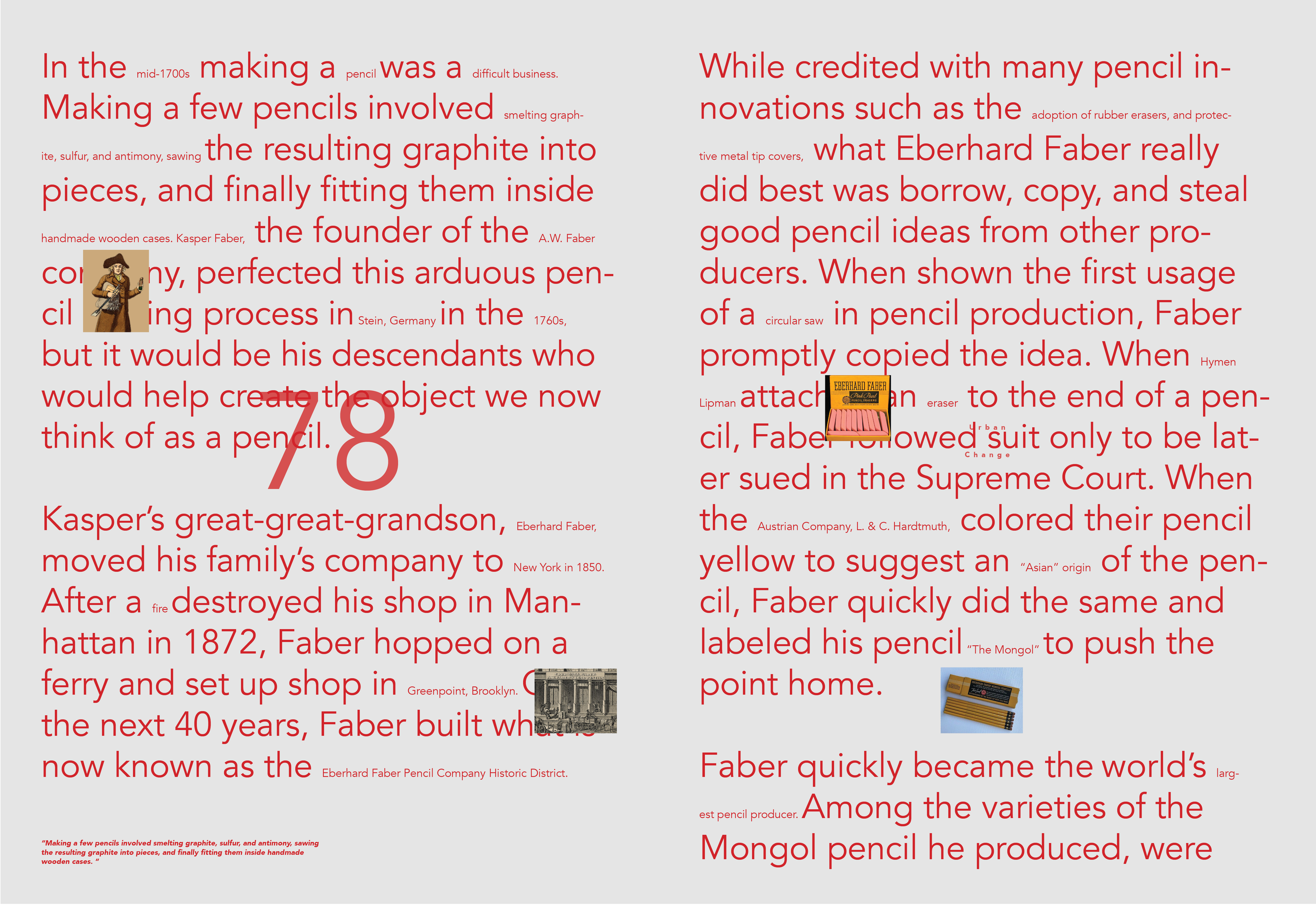
Timeline: November 2020 – January 2021
Tools: Adobe InDesign, Photoshop
Skills: Thematic research -> editorial design -> printing -> perfect binding
Tools: Adobe InDesign, Photoshop
Skills: Thematic research -> editorial design -> printing -> perfect binding
The significance of “repurposing”
I’ve always had an affinity for visual things, and my parents nurtured this interest early on by enrolling me in studio art classes. It confused me that I enjoyed industrial design, CGI, and architecture more than replicating master paintings and drawing academic still lifes. I’d studied studio arts for over 12 years, but always had a gut feeling that it was not the right visual field for me. After having trained as a fine artist for over a decade, I pivoted from this identity marker in order to a focus on building, projecting, and designing experiences: something I am much more passionate about.
It is difficult to pick a field of study and be expected to stick with it for the rest of their lives. Life pivots should not be seen as failures. Even the best of us have to repurpose and to adapt in order to pursue crazy ideas and embrace new beginnings.
![]()
Inspirational figures behind this magazine
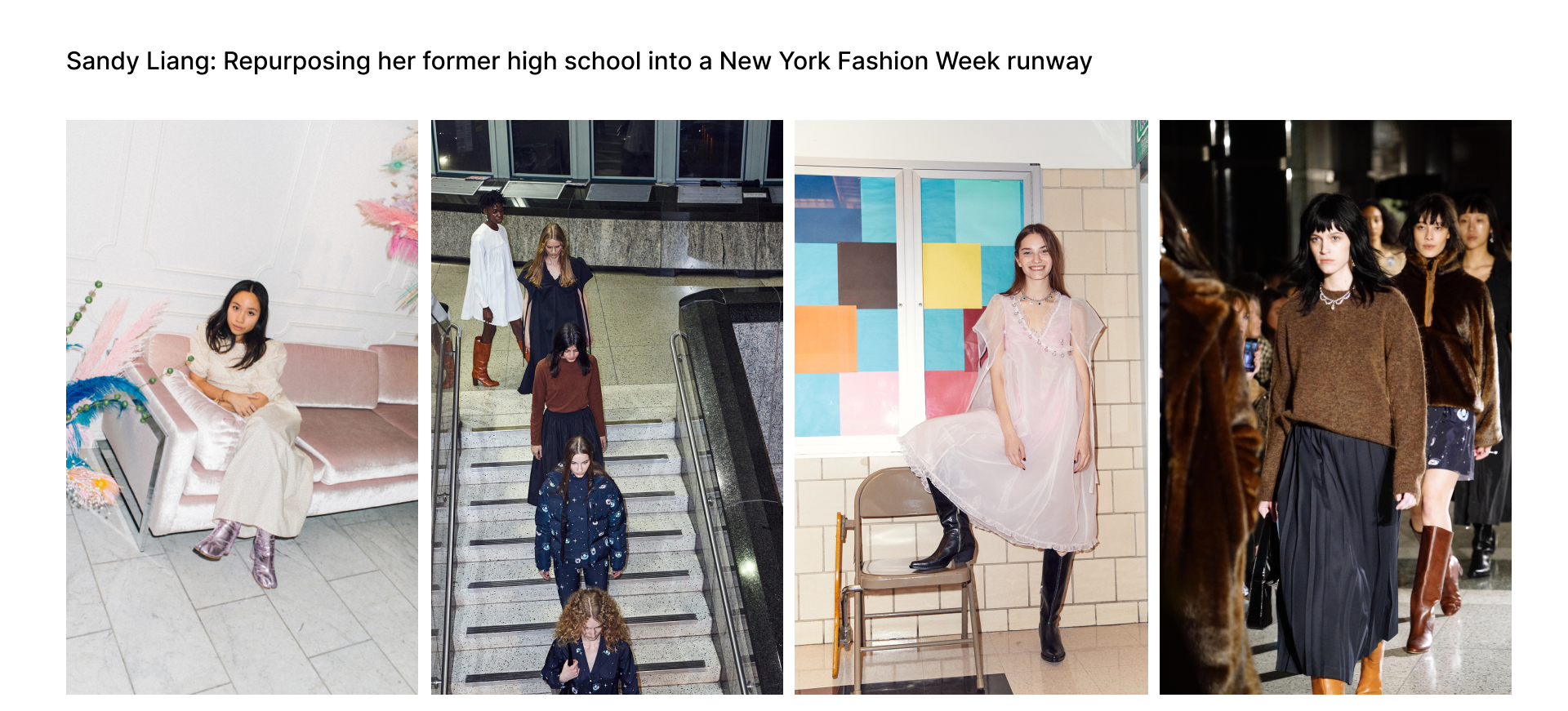
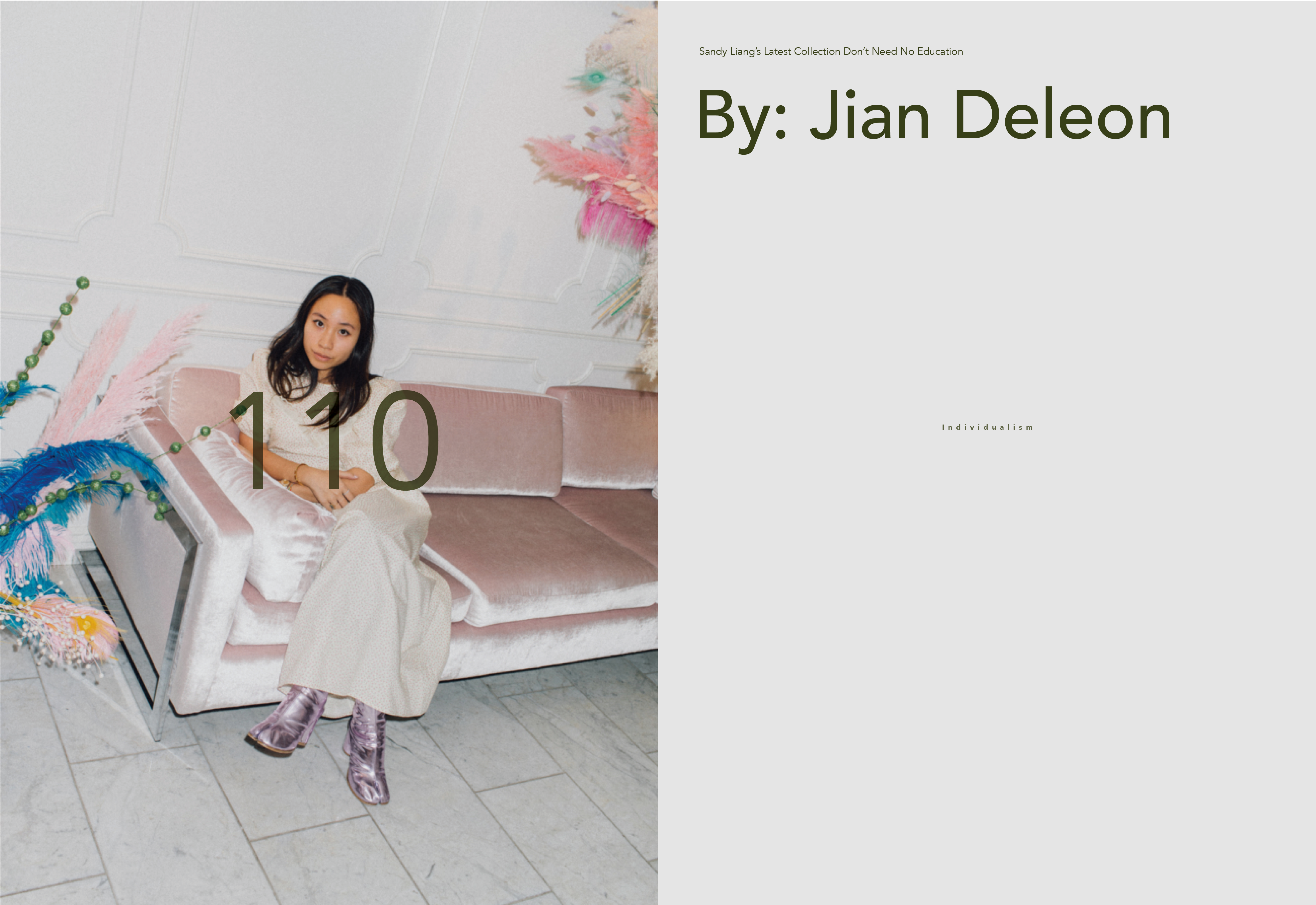
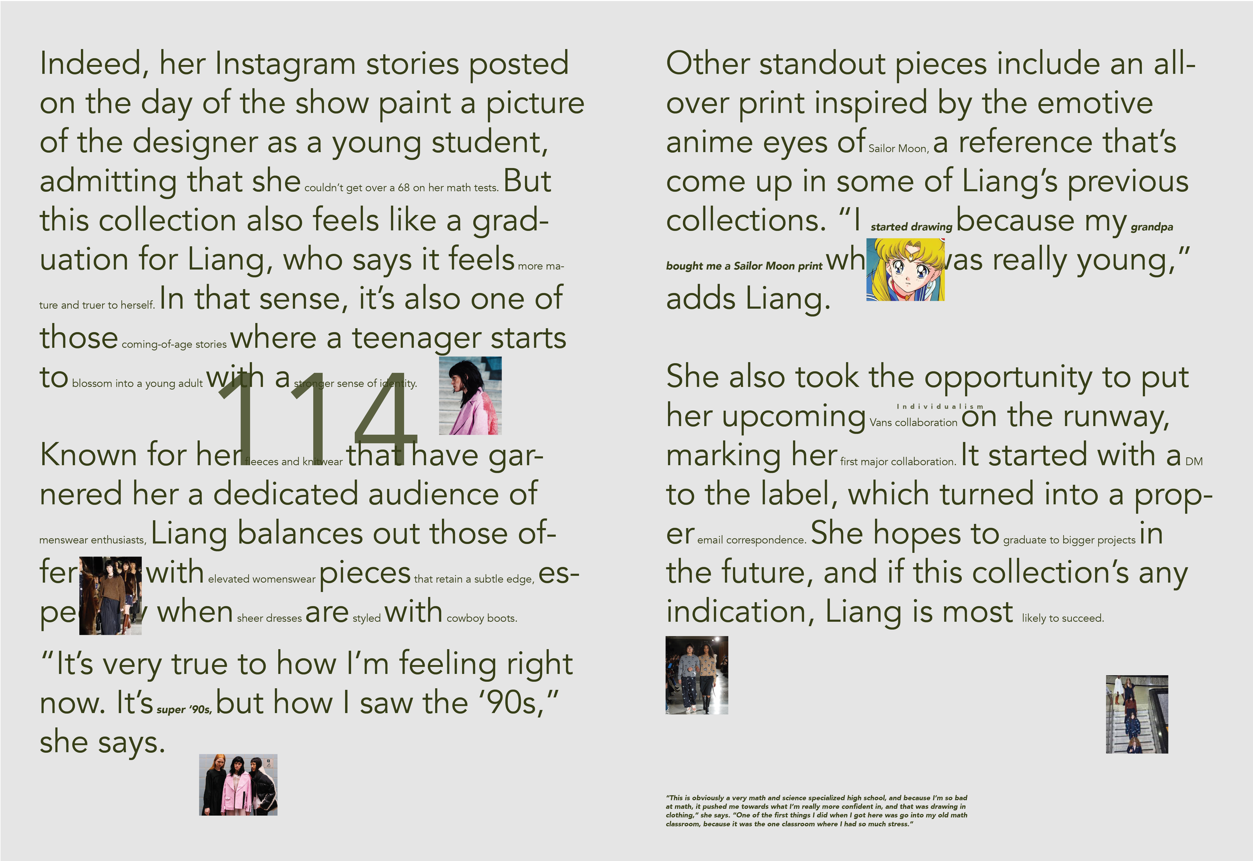
Inspirational figures, for me, include designers Sandy Liang and Kristina Ang. These are two women who had “repurposed” their lives by making pivotal career choices. Sandy’s experience in a STEM focused school pushed her towards what she is really confident in, and that is expressing herself through drawing and clothing.
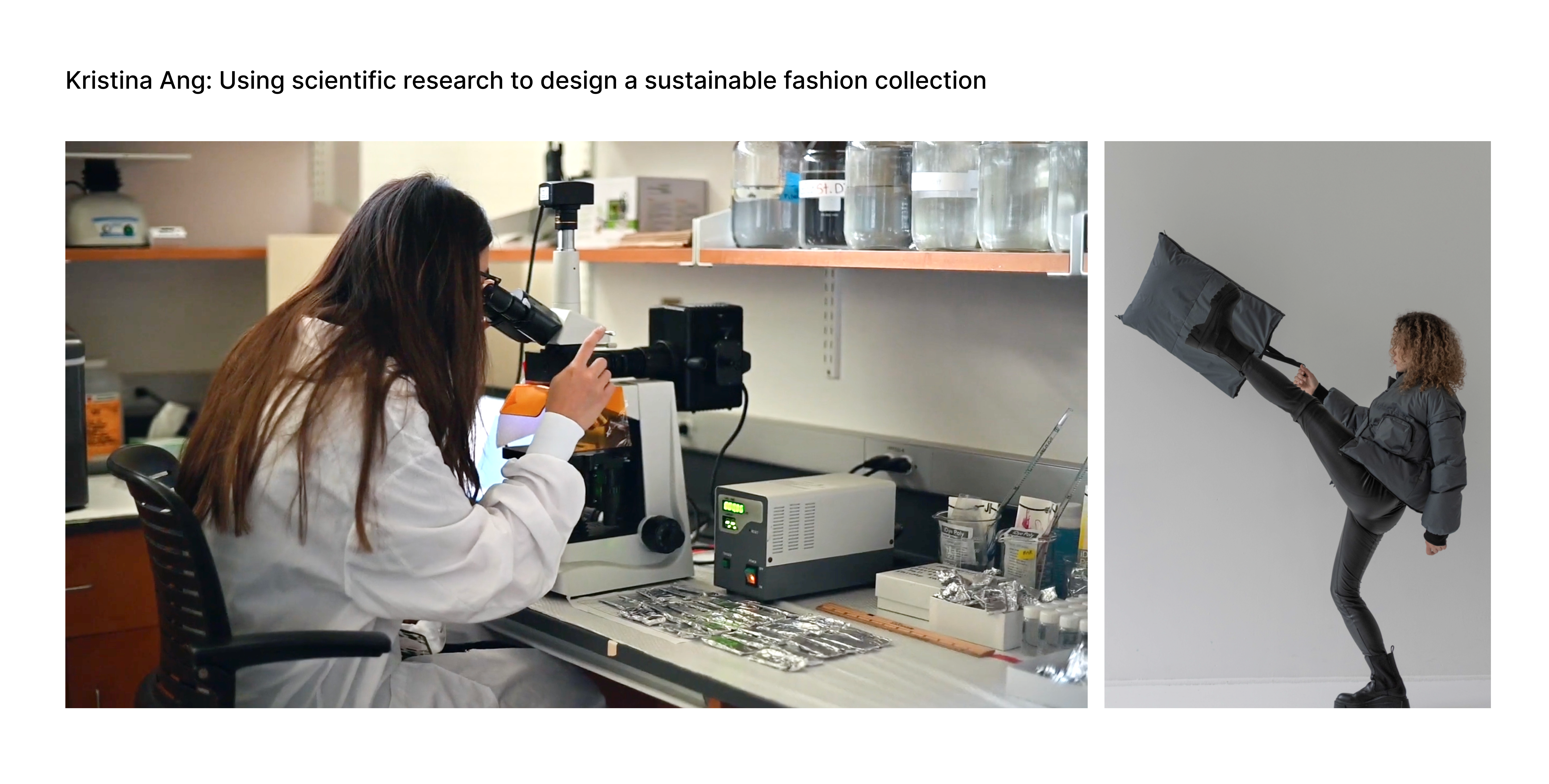
Kristina was always drawn to science, but decided to study design. STEM and creativity are often separated into two distinct categories, causing Kristina to questions the legitimacy of a STEM background in the context of a fashion space. Ultimately, however, she realized that her skillset, at the intersection of science and design, is very much in demand.
It is difficult to pick a field of study and be expected to stick with it for the rest of their lives. Life pivots should not be seen as failures. Even the best of us have to repurpose and to adapt in order to pursue crazy ideas and embrace new beginnings.

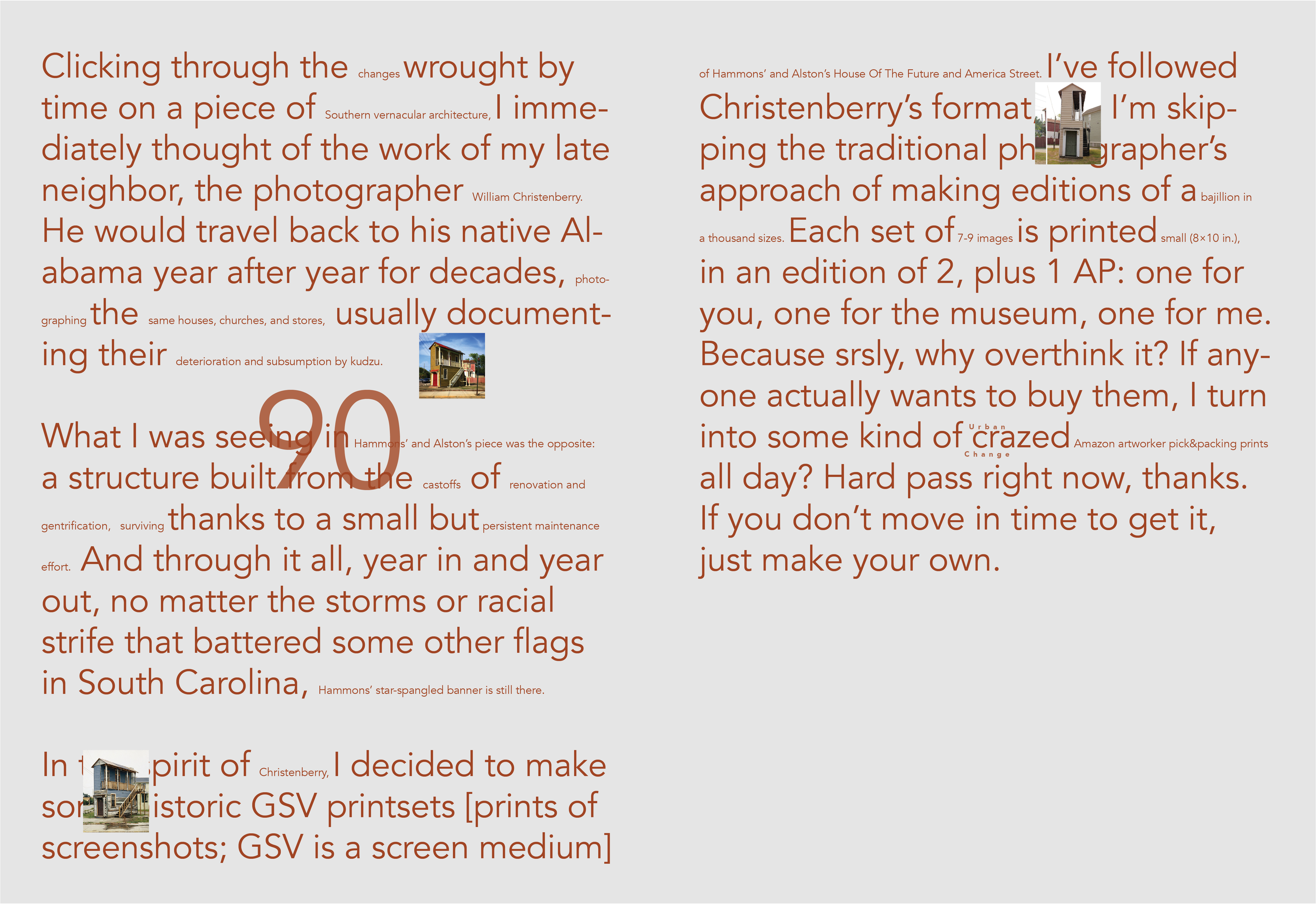
Inspirational figures behind this magazine
Inspirational figures, for me, include designers Sandy Liang and Kristina Ang. These are two women who had “repurposed” their lives by making pivotal career choices. Sandy’s experience in a STEM focused school pushed her towards what she is really confident in, and that is expressing herself through drawing and clothing.
Kristina was always drawn to science, but decided to study design. STEM and creativity are often separated into two distinct categories, causing Kristina to questions the legitimacy of a STEM background in the context of a fashion space. Ultimately, however, she realized that her skillset, at the intersection of science and design, is very much in demand.
Repurpose Magazine: Challenging traditional type hierarchy to accentuate my theme
I created an editorial publication called Repurpose Magazine. I was interested in the theme of repurposing because many businesses and individuals have had to “repurpose” in order to acclimate to the the changes brought on by the Covid–19 pandemic.
I challenged myself by attempting to repurpose the images and text on my page to bring them out of the traditional type hierarchy while still adhering to a structured grid system. I blew up bylines and minimized titles. Images are tiny & the more important “highlighted” portions of the text are in size 10 to accentuate the act of repurposing.

Final magazine
The articles in my publication all relate to repurposing over time,whether it is how architecture is repurposed, how individuals go through career or life pivots, or how objects are repurposed to become more practical and multifaceted, etc. Five different colors separate the stories within the publication five different categories of repurposing: urban change, environmental, cultural fabrics, resilience, and individualism.


// I love typesetting! Again, please reach out if you’d like to see more traditionally typeset editorials